
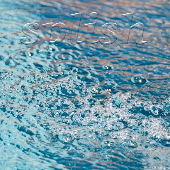
I’ve written before about the 52 Week Photo Challenge online class that I’m taking from Ricky Tims. Best class ever! This week’s assignment is how to add a text overlay to a photo.—yet another cool thing that you can do in Photoshop that I had no idea existed.
I’ve taken 3 photos (Splish is one of them) and I like them all. If you have a bit of time, please do click here and then leave a comment on this post telling me which one you like the best.
Choosing the word(s) was the hardest part of this photo challenge. The same thing is true when you add words to a quilt, as I wrote about in this post. Text is powerful. It draws the eye and, no matter how big or small it is, what you say can dominate a design. The quilt that I made after that post is called Say Something (below), which is in The Quilter’s Practical Guide To Color.

The words take up a small percentage of the space on the quilt, but they are the focal point, dominating the design. This is good to remember when you want to make what may be a simple quilt into a more complex statement.
Update: Thank you all for your comments! I’ve decided to submit the car photo because I like it as is. After reading your comments, I think I need to make the word “splish” more legible in the water photo and I don’t have time today to do that. So, the car photo it is and I can mark that off the list. Thanks!


Becky, I like “Splish!”
LikeLike
Dear Becky. Splash was my pick. Looks like you are having a great time taking great pictures.
LikeLike
Splash is my favorite. I love photos of water.
LikeLike
All three are good but I like Splish because you can ‘feel’ the drops of water and ‘hear’ the sound of water moving. Well done.
LikeLike
I am drawn to “Splish” . It has wonderful color, intriguing texture and movement with the bubbles, and compelling light. Well done!
LikeLike
I like i spy…..then splish. I spy is so clever and a bit cheeky!
LikeLike
I like I Spy because I’m intruded – I want to look through the hole and see what’s there. Although I very much liked your other pics, I Spy told a story and pulled me in.
LikeLike
. . .because I’m INTRIGUED, not intruded! LOL!
LikeLike
My favorite part of the three good and interesting photos is ‘displaced.’ The words are quicker to read and are more visible to my eye.
LikeLike
I like “splish”. The simplicity of the composition makes it compelling.
“i spy” also makes a big impact, but I don’t think the text is visible enough. Could just be my monitor, of course.
Thanks for sharing your photos!
LikeLike
Did like splish. I can “hear” the splash!!
LikeLike
Splish has so much movement, I can almost hear the bubbles coming to the surface!
The pic with the car has clearer wording, for my eyes, anyway! Great pics, thanks for sharing.
LikeLike
Becky,
I liked Splish the best. I Spy didn’t move me. I loved the truck, but not so fond of the word on it. I have loved the assignments you’ve shown us. You have a wonderful “eye” for this class!
LikeLike
Definitely like “Splish” the best.
LikeLike
Taken as presented, I vote for “Splish”. Actually I like the whole-in-the-door photo best but might try for a different phrase than, “I spy”. Just my opinion.
LikeLike
Splish is my fav of the three also. The car was good too, but ehh. Couldn’t decipher what #3 was.
LikeLike
Well – these old eyes don’t see the words much in two of them – so I like displace since I can differentiate the word from the back ground. I still like to be included.
LikeLike
It is fun to add text to photos – so many choices, so little time! I choose and like the “displaced” car photo for the best text. The chosen style and size text and placement balances out the photo quite well. The water photo is gorgeous and I like the choice of word. However, I think the chosen text style does not compliment the photo and is “wishy-washy”. As for the hole in the wall, to me the style of the text does not compliment the photo but I like the words choice.
I like the comments you made about how you made changes to your photos. It would be even more interesting to see both the before and after photos.
LikeLike
The “I spy” wasn’t sharp enough for me but maybe that was your point. I like both of the other ones fro different reasons. The water one I liked with the colors. The grass/trees were darker and stood out. To really make a fair comparison I’d have to see the same photograph done with different fonts or whatever you changed.
LikeLike
It’s a tie for me between Splish and I Spy. I love the movement of the water in Splish, but I Spy is mor complex and intriguing. I envy you this course!
LikeLike
I love them all but my favorite is displaced. Reminds me of simpler times, traveling country roads, old displaced in a newer environment.
LikeLike
I like “I Spy” but I agree with the comment that the text could be a bit more visible. I like all 3 but “I Spy” best. Great texture, draws the viewer in…
LikeLike
I liked “Splish” because of the movement of the water. I had problems with “I Spy” because the text was not particularly visible as well as being a distance from the focal point of the hole above the latch.
LikeLike
I like birth I Spy and Splish for different reasons. I Spy is intriguing, makes you look carefully to find the words, wonder at what is hinding, lovely color choices. Splish is a more obvious choice, can be peaceful or noisy, definitely cooling and calming, doesn’t make you think about what is happening. Still all three pictures are great.
LikeLike
Ok let’s make that both not birth, but I guess in a sense you did birth the creative process.
LikeLike
I like splish. You don’t have to wonder what it’s about-you just know.
LikeLike