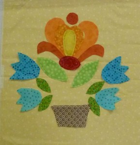
Today, the first day of a 2-day class, was the design day. Everyone in class worked on coloring their block from Passion Flowers (from our book Applique Outside the Lines). I took a photo of many of the blocks and it's fun to see how different they are. As you look at them, pay attention to where your eyes go, to what you see first and how the block feels to you. I very much enjoy seeing how students work with color!

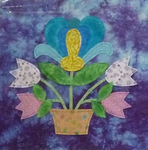
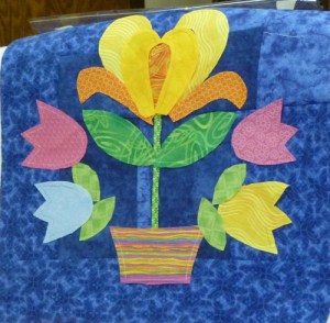
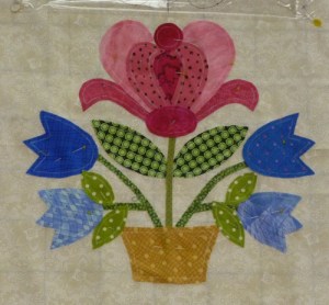
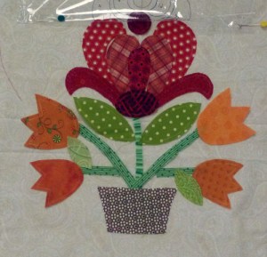
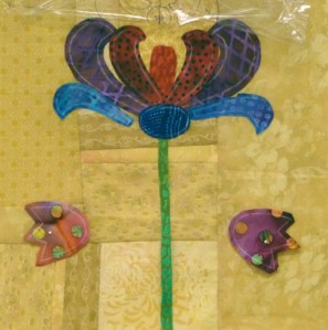
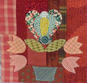
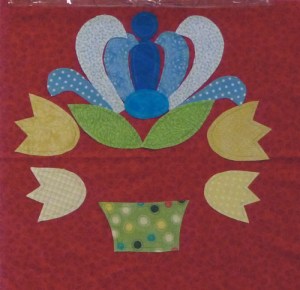
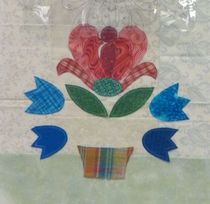
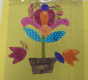
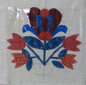
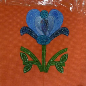
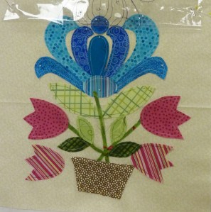

Wonderful variations! How exciting to see what different colorings everyone has developed!
LikeLike
If you count down three – that is the one that blends the best – to me. But, is that what we should want? or should emphasis be put on the flower or the basket to stand out. I think the third one blends because of value/tone. Just my thoughts/questions. Judy C in NC
LikeLike
I like the third one down as well, but I think the fourth one down appeals to me the most – especially the main flower fabric choices. I also think the last one is headed in the right direction. The variations are amazing – and probably reflect each personality, which is what it’s all about. None are wrong – each one appeals to someone! Thanks for sharing – will we get to see further progress?
LikeLike
In answer to both Judy and Cassie:
Whether the flowers blend or not, whether they work or not, is really up to the maker. I know that there are some of these blocks that I like better than others, but that isnt the point. What is important to me is that each person in class comes away with a better understanding of how to use color and pattern to get the look they are after.
I wish I had taken photos this morning of the blocks but there just isnt time on an applique class day to do that. At least there isnt the way I teach an applique class :-). Im teaching Whirlygig tomorrow and I hope there is time to take photos of work from that class.
LikeLike
I can see that everyone has their own ideas about color. I, too, like some of them much better than others, but then, it’s not my block or my quilt it will go in. I have a weird sense of what’s right/wrong with color blending, so have to be careful what I say to others. Our quilting guild has had me teaching some ‘newbies’ and their color sense isn’t as developed as others are. It’s hard not to intrude my tastes on them and to let them make mistakes so they will learn. I guess that’s the hardest thing I’ve had to do — standing back and letting them develop. It’s HARD, but I have managed so far.
LikeLike