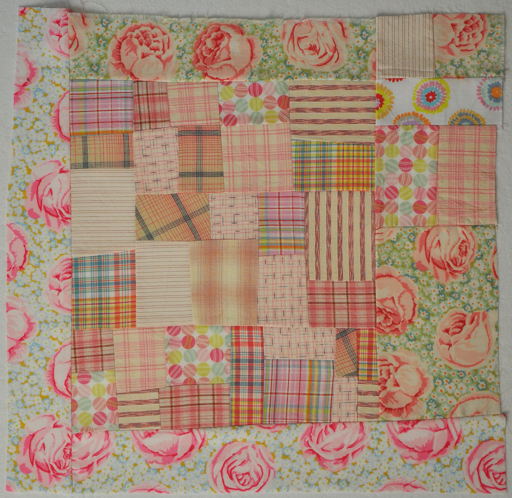
I got an email reminder from Ami that my World Series quilt HAS TO BE IN HER HANDS BY AUGUST 1ST. It’s as if she knew that my foot is enough better that I can stand for short periods to cut, iron, and sew. So I got to work Monday and constructed the background.
A friend suggested that this quilt be pink. Since that’s the primary color of the quilt I made for the traveling exhibit I thought that made sense. I like pink and, more importantly, it feels right for this quilt. Pink feels hopeful and there is a kernel of hopefulness in the sentiment I am trying to convey (click to go to my first post about this quilt).

Usually I build this sort of block on the wall but because of my foot, I
looked at it flat on my table during construction. I was glad when I
put it on the wall that it looks the way I intended it to. The actual
block is a little lighter than it looks here but it is still an active
background. My intention is to put strong colors on top of it and that
will push the background back.
The next question is which side is up? I looked at it four ways. Below it is turned once, clockwise…

Turned once more, clockwise…
And again…
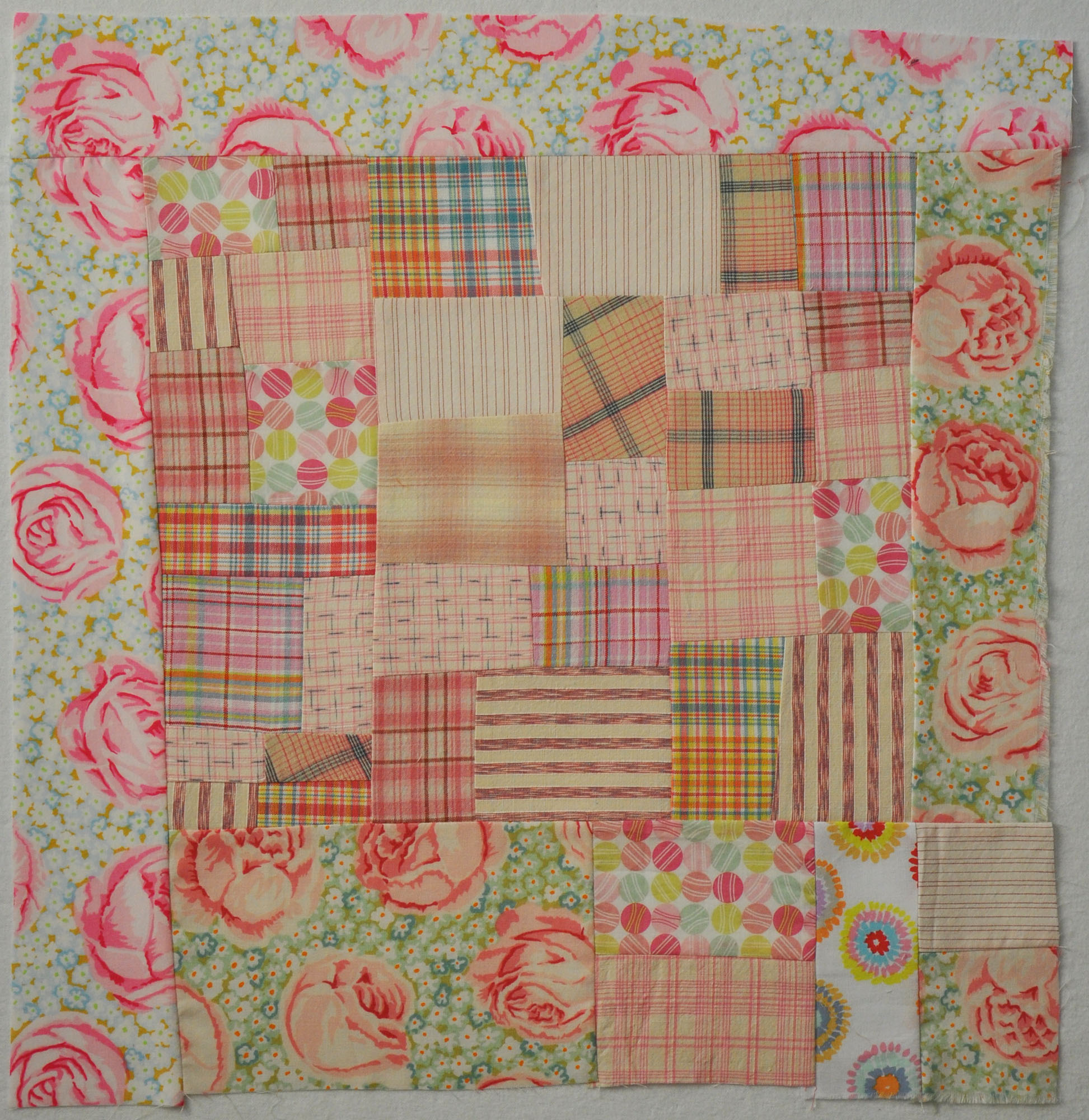
When you piece backgrounds, especially ones made from a variety of
fabrics, it’s a good idea to look at them turned different ways. What you thought was ‘up’ may or may not be the best orientation.


brilliant! soft pinks are so good! a wall def is a good thing, laying it flat is very awkward for me to handle. i dont quite have the knack for sizing it up on a flat surface.
ps. i missed you this weekend. i hope the foot feels better :(.
LikeLike
IMHO, the 4th picture is best. Can’t wait to see what colors you add on top.
LikeLike
What a fun background! I like pic #2 the best. Seems ‘weighted’ right – does that make sense?
LikeLike
I’m with Eileen; #4 for me. The weight / layout with that large swatch of the darker rose fabric on the bottom left balanced with the border-like swatch on the upper right feels “right” to me. 🙂
LikeLike
Im happy to hear all comments about which way is up!
LikeLike