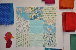
I've been working on the house quilt. My initial thought was to use these backgrounds with strong, mostly solid fabrics for the houses.
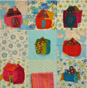
Then I started putting houses on them I wondered if they were too busy…
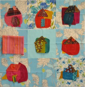
…so I changed some. This is a bit better.
I have the backgrounds cut at 6" x 6". They finish at 4" x 4" so there is a lot of fabric there that will be gone later. The thing is that I don't want the houses to be overshadowed by the background. So I tried this, which was OK.
And I tried this which is good but a little boring.
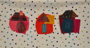
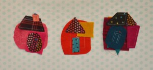
While the houses really show up on this last, quiet dot I'm torn because I like the second set of busy backgrounds too. But I plan to use some embellishments on this quilt and they might get lost if the backgrounds are too busy. Feel free to let me know which one(s) you prefer.


I like the original mix. How do they look if you turn them over and use the back side as the front? Sometimes that can keep the movement but quiet the background enough.
LikeLike
I like the multi-colored dots….second from bottom. You could embellish to your hearts content with that one.
LikeLike
I’d go for the multi-colored dots . . .second from the bottom. The texture feels good.
LikeLike
I think the second one is the winner…not too busy, not too flat….just right GoldiSmith. The embellishments will show up if they are bold enough.
LikeLike
You all are surprising me! So far Im opting for the last, quiet dot. Ill post a photo when I can.
LikeLike
I like the original fabrics except the top row middle one.
LikeLike
i too vote for the multi colored dots, mostly because you are going to add words, and they would be lost on the other prints.
LikeLike
OK-since you asked, I think the blocks are all too busy for the houses. I LOVE the blue/green/black dot. Just enough background for interest while not overpowering the houses. I say go with the first dot pattern. But you are the expert.
LikeLike
IMHO I like the simpler prints eg in the 1st photo the top right(maybe?), centre and bottom centre prints then combine these with spots in the last two photos.
LikeLike
You definitely should use the multi-color dots. Just enough brightness to give some punch and your embellishments will stand out wonderfully. IMHO Judy C
LikeLike
I love the whole idea! My only change would be the house in the lower right hand corner. It gets kind of lost on the background.
I think what the World Series teams are doing is awesome!!
LikeLike
The dots are nice but too predictable. Go with your original thought.
LikeLike
I actually like the first “busy” backgrounds.
LikeLike
I like the green and blue dots. It is interesting but not to busy.
LikeLike
I like the big bright dots, but I suspect the embellishing will make that too much, so my vote goes with the light dots.
LikeLike
Since you are planning on adding embelishments I vote for the last one. I think they will get lost on the busy prints. Now, without embelishments I like the first set of fabrics…..
LikeLike
I’m not going to be much help. I see your advisors are all over the place. I vote for the brighter dots!
LikeLike
Finally! Someone agrees with my current assessment :-).
LikeLike
I like the second set of backgrounds, the big prints leave room for the houses..if that makes sense. And the lightcolored dots…well they are just not YOU!
LikeLike
I’d go with using both of the polka dot prints, maybe putting all the lighter prints in the center of the quilt and the brighter dots around the center…I ‘dunno but use both in some way, I can’t get enough of polka dots.
: )
LikeLike
To my eyes the pale dots are the way to go….. the background fabric in this cases is only to hold all the other goodies your are sewing on….. there will be plenty of busy and places for the eyes to see.
LikeLike