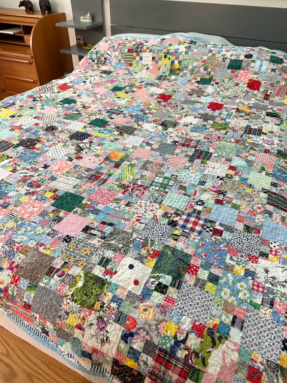
I machine quilted together two vintage tops to make one quilt. The trip around the world side (below) is very nice. The pattern is easy to read… it’s happy!

The quilt top I put on the back has alternating 3″ squares and 9-patches made from 1″ squares. There isn’t an underlying theme or color palette on this side. It is mostly prints, plaids, and stripes that are individually wonderful, but together are a hot mess. Your eyes have nothing to focus on.

Look at the two, together…

Your eye can rest and explore the trip around the world. There isn’t any resting when you look at the 9-patches. And more to the point, there isn’t any real pattern.
Generally speaking, when we go to the effort to cut fabric apart and sew it back together, we do so for a reason. I wonder if the maker of the 9-patch just wanted to sew and had no other plan… because that’s what it looks like. And I absolutely understand that because I have done that myself with equally questionable results 🤣.
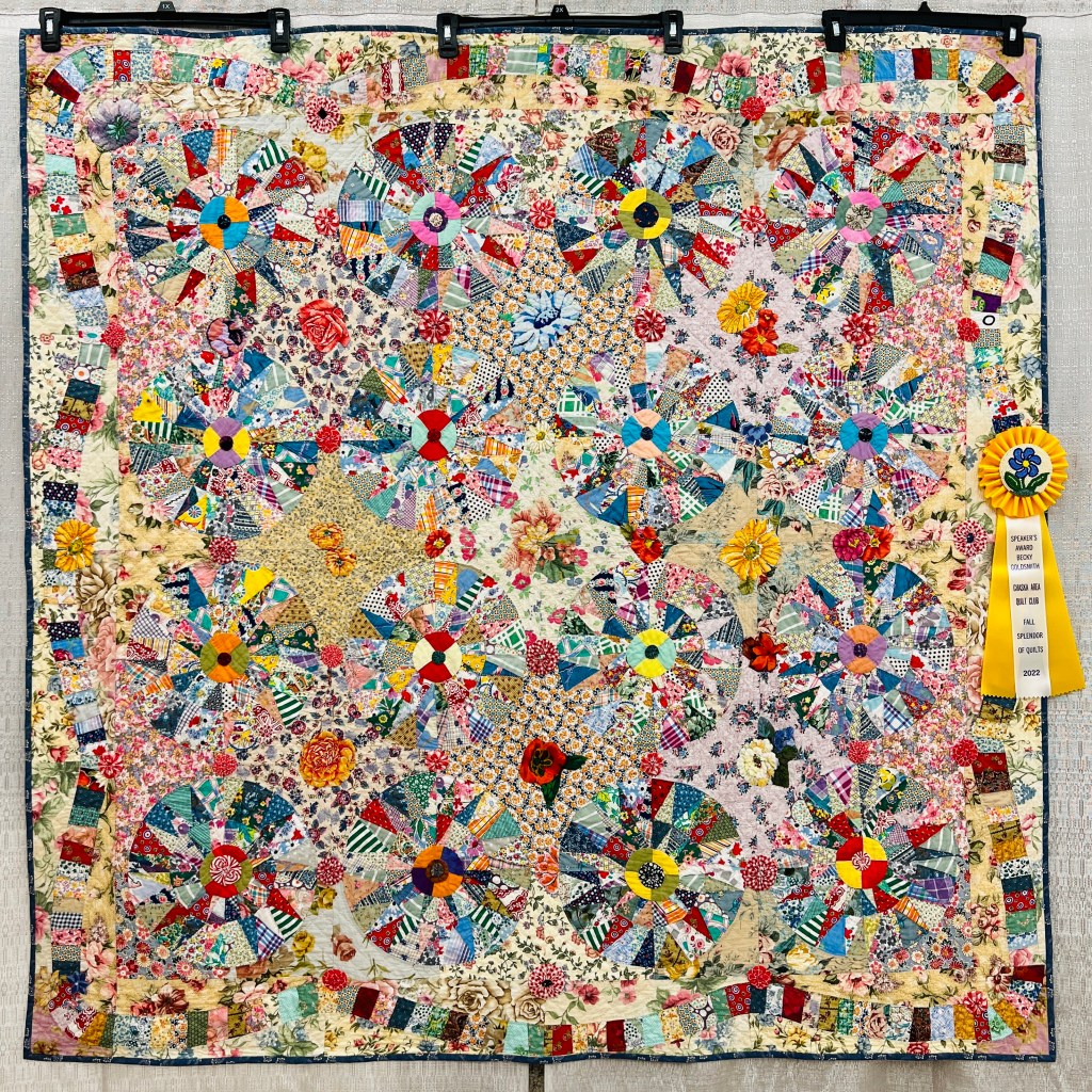
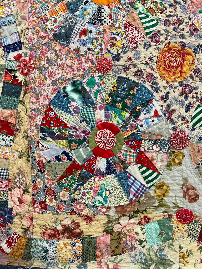
But that doesn’t mean you can’t successfully test the boundary between pattern and chaos. I wrote about the quilt below, Carnival, made by Joan Goetteman and Audree Sells, in this blog post. It was my Judge’s Choice at the Chaska Fall Splendor Quilt Show in 2022.

Yes, there is chaos, but it is not total chaos. There is just enough pattern to keep your eye happily busy. You may not be drawn to this level of visual activity, but I still love this quilt.

If you are interested in making this sort of quilt, go for it! Here are a few tips:
- When you find a quilt that embraces this sort of chaos, study it a bit to see what does and does not resonate with you.
- Consider how to create some sort of recognizable arrangement/pattern.
- Group colors in a way that enhances the plan you have in mind.
- Play small and large prints off of each other.
- Use a design wall!!!!
Happy stitching!


That is an interesting solution to what to do with a vintage top that is a hot mess. I have one of those, myself, that I was just leaving as is. Maybe I will use it to back a different vintage top from the same source.
LikeLike
I’m thinking that both of the makers on my quilt would be happy that their work is out of the closet and being used 😁
LikeLike
I really like the two quilts together, especially the nine patch one on the back. It’s what I call “Gotta Go” quilt, all these fabrics have got to go.
LikeLike
Gotta go… that’s good!
LikeLike
The quilt is alive and that’s what really matters. You knocked it out of the park.
LikeLike
I do love the Trip Around the World on the front – it is eye candy! However, the one on the back inspires me. I received a large portion of a deceased friend’s fabric stash; I recently discovered a number of orphan blocks in the stash – most likely practice blocks and extra blocks, along with some unusable blocks, and probably some “someday” patterns. I have been trying to decide how to incorporate all (or at least most) of these blocks into a memory quilt. This quilt is giving me permission to take the plunge! Thanks for the inspiration.
LikeLike
Great! It will be an adventure :-).
LikeLike
WOW WOW WOW!!!!
LikeLike
In the photo of the nine patch my eye finds the darker green blocks and the red blocks to settle taming the chaos for me.
LikeLike
In person, looking at the whole thing, the green and red stand out. To my eye they don’t calm the chaos enough, but you are correct that they do help and could be enough for you and other viewers :-).
LikeLike
This is a great idea to use up some tops that otherwise may just lay unused. I have a couple that singularly I don’t want to take the time to quilt, but if I can do two at once …. Thanks for the idea!!
LikeLike
Definitely like the “stacking” idea as a way to use older tops. My sister-in-law is very good at using scraps to make tops and I know others who have this talent as well. Not sure that is one of my talents. I know the quilt won a prize, but it hurts my eyes. I think that using scraps to make tops is just something you have to have the eye for. Thanks for sharing, Becky. You are always so creative and interesting.
LikeLike
I love scrap quilts but one definitely has to watch out for visual overload. The ribbon winner is a great example of how to use a wide variety of scraps yet still have each one stand out. I really enjoyed this week’s blog. (I recently finished a scrap quilt comprised of 2,816 1.5” squares, mostly fabrics from other quilts or clothing I had made for my kids. We use it as an “I Spy” game.)
LikeLike
Forgot to mention that there is an overall design to the quilt which helps the viewer to “see the forest for the trees”.
🙂
LikeLike
That sounds like a wonderful scrap quilt! Perfect for I spying…
LikeLike
I spent a long time crafting a response to this beautiful and helpful post only to have the system not take it. I should have written it elsewhere and pasted it into the message. I’m sad, especially because I waited days to formulate my response.
LikeLike
Yes, but now I know that you liked the information well enough to think deep thoughts. All good :-).
LikeLike
Thank you, Becky. As you could tell, frustration had set in.
I have had a few more days to chew on the scrap success subject, primarily because I’m working on a scrappy project at the moment (when am I not?). This is not a rewrite of the post that vanished, but …
What are your thoughts about using both white- and cream-based scraps in the same quilt? Does it matter as much if you are not, for example, string or strip piecing where you want a big section to read as the same color? Does it matter less if you’re using all prints rather than a combination of prints and solids?
Other deep thoughts are percolating. I do love scrap quilts and I would love to make quilts of which I am proud. Ones that shine.
ldp
LikeLike
I mix white and cream often enough that it no longer bothers me. One way to know if it’s going to work or not in the area you are piecing is to pin the scraps together up on the design wall, stand back, and give them a look. If something sticks out in a way that you don’t like, take it out. If you miss it, put it back.
Also, white will come more forward (clearer color) and the creams may sit back a bit. knowing that can help you plan the composition.
LikeLike