I read an interesting op ed piece in the NY Times today: "Are We Living in Sensory Overload or Sensory Poverty?" by Diane Ackerman. She writes about noticing, on a walk through the park, that so many people's eyes and ears were glued to their devices and that they were missing so much of the beauty around them. It's a piece worth reading. Here's an excerpt:
"…As an antidote I wish schools would teach the value of cultivating presence. As people complain more and more these days, attention spans are growing shorter, and we’ve begun living in attention blinks. More social than ever before, we’re spending less time alone with our thoughts, and even less relating to other animals and nature. Too often we’re missing in action, brain busy, working or playing indoors, while completely unaware of the world around us. One solution is to spend a few minutes every day just paying close attention to some facet of nature. A bonus is that the process will be refreshing."
In my lectures I try to point out the importance of paying attention to what you see. I find that the things/shapes/colors that make me stop are worth at least of little bit of my time and attention. Even if they never end up in a quilt, what I see informs the quilts that I make. That said, I am also guilty at times of paying attention to my iPhone instead of the actual world around me.
I very much enjoy my digital devices. I use them to stay in contact and to record many of the images that strike my fancy. They are oh so handy! I just have to remind myself that sometimes it's better to look and not record. That said, here are some images that I've captured and have been meaning to post.
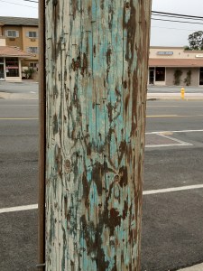
On my walk yesterday morning, the colors on this power pole made me stop. I love the mix of blues and whites and browns. Then I looked up.

The pattern of the wires, etc., was really nice. The lack of color, in comparison to the colors on the pole below it, was also interesting.

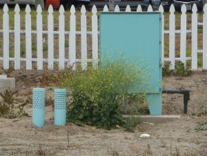
Farther down the street were these blue utility 'objects.' Isn't the picket fence behind them nice? The fence was completely out of place where it was, but still – nice. I'm pretty sure the colors are what made me stop but I also like the mix of shapes and lines.

I saw several of the circular pipe-like things with dots/holes that I'm guessing are for ventilation of something below ground. I was in Costa Mesa, right next to Newport Beach. I think this shade of blue belongs to one of these cities.
There is something about aqua that I can't seem to get enough of. I'm sure I'll get over it but I don't know when.

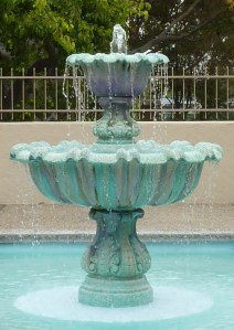
This fountain was outside of the the room where I taught class yesterday for the Flying Geese Quilt Guild in Newport Beach. We had a lovely day and the splashing water outside sounded so nice!
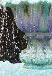
The only time I had my camera out was before class and I the only thing I had time to photograph was the fountain. And sure enough, it was the many shades of aqua that drew me in. The fountain looked to be made from some sort of agregate rather than concrete.
I don't usually think of mixing purple with aqua, but isn't this great!

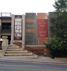
Last for today is the picture I took a few weeks ago showing the front of the library in Kansas City, MO. The whole front of the building was covered in 'books'. It absolutely worked. It made me think of my son, Chris, who loves books more than anyone else I know. So Chris, this one's for you:
