Why I bought what I bought…

Two things you should know:

  1. I don't shop for fabric that often. I shop when I find myself at a quilt shop and that's not nearly as often as you might think. When I travel, it happens sometimes. When Linda is here, we go to the Quilt Asylum. Other than that, I work out of my stash. But every now and then, the stash needs an injection of new fabric. I rarely have buyer's remorse after a shopping trip.
  2. I don't buy fabric for specific projects. If I have a quilt in the planning stage, I look for fabric that could work in it, but I don't shop for specific areas of a quilt. What I mean is that I don't look at a fabric and think: "I will use this fabric for that square."

In my last post I explained why I bought so much 'text' fabric—I like the visual texture. Why did I buy so much red?


WhatIBought copy

I need to make a monochromatic quilt for the color book. That would be a quilt made from only one color. To do that you need many values of that one color: lights, mediums, and darks. 

To be specific, I am talking about fabric that has only one color in it—no 'extra' colors added to a print. You can buy solids and tone-on-tone prints in values from light to dark in green, blue, purple, yellow, orange, etc.—and the colors are still recognizably those colors.

What happens to red when it gets light? It goes pink. Or orange. Very dark reds lean toward blue/red or orange/red. Making a truly red monochromatic quilt is kind of hard—so that's the one I'm going to make for the book.

I have not been able to build a light to dark, fire-engine-red stack of fabric in solids or tone-on-tone prints because there isn't enough value difference without a color change. I can do it with prints, but only if I accept that white can be added to red. Tell me this: Is that cheating? 

I want this quilt to read 'red'. I am not going to use red and white fabric that has any 'extra', accent color. (That doesn't mean that I didn't buy any red/white fabric that didn't have other colors—I'm just not using them in this monochromatic project.)

The very lightest of the fabrics you see in my stack almost read more white than red and my plan is to use very few of them. 


Reds-01 copy

I love that stripe w/little dots on the right so I bought a yard of it. It might be used in the quilt, or not. It would be a great binding on this or another quilt.

The stack above is arranged in a lovely gradation from dark to light. Now, look at the same fabric stacked side-by-side, dark against light:


Reds-02 copy

I know I'll want to use more fabric from my stash in this quilt—that's what I was thinking when I bought these fabrics. I have no idea what the quilt pattern will be. Probably it will be pieced because I don't have much time left to make another applique quilt. But this is a good start! 


Where did the week go?

You might have noticed that I haven't posted for a week. I was laid low by a sinus infection for a couple of days and then Linda came for a working visit. 

Linda came for a visit because she is out of stitching—oh my! She came to Texas so that I could draw her next group of projects. It's so much easier to get the drawings right when we're together. She knew what she wanted but as the drawings progressed, ideas changed. It's always a little slow going in the beginning but, after 2-1/2 days, we were done. Yay!

During that time there was the usual hustle and bustle in my house. Lorna was here to fill orders, the kids were here with her… Linda told me that now she knows why I am sometimes stressed when we talk on the phone :-).

I love my grandkids and Lorna has to bring them with her when she works, but it can be hard for me to think when there is so much going on around me. However, I really want Lorna to come work! While Linda was here, I had an idea (or maybe Linda had the idea): I am going to pay/bribe Jack to play quietly when he's here and I'm working. He would love to make $1 a day and I would love to focus—it's a win/win, don't you think? I'm going to the bank on Monday to get a stack of $1 bills.

After the drawings were finished, Linda and I had time to go shopping at our favorite Texas shop, The Quilt Asylum. We spent 2 hours—and about $450 each. I knew, as my pile grew, that it was not going to be an inexpensive trip to the quilt shop. 

People sometimes ask me how I choose fabric. As I was folding this group, I thought that could use this group as an example.

Here is what I came home with, washed/dried/folded and neatly stacked (click on the photo and it will open larger):


WhatIBought copy

Most of the fabrics are fat quarters. If you see more of an edge of any fabric, it's probably a yard. I bought a couple of 1/2 yard cuts and a couple of 1-1/2 yard cuts.

Notice that these are clear colors, not gray/muddy colors*. I use clear colors 99% of the time. I know that every one of these pieces is going to work with the vast majority of the fabric in my stash.

*If you have trouble imagining what a 'gray/muddy' color is—think civil war, or Thimbleberries, or Jo Morton quilts. It's not that those are bad colors. Rather, they are not the kinds of colors that I use. I don't buy them. I don't even see them in the quilt shops because I don't spend time looking at them. Really—they are invisible to me. If this is the palette you use, then the fabric in my pile above is probably invisible to you— and that is OK.

Look at the stack on the right (above). Half of it is green and the other half is split between orange, yellow, and brown. It used to be that I bought more green than anything else. In the last couple of years that shifted to blue. Look at the stack on the left—There is as much blue as there is green/yellow/orange/brown combined.

The black/white/cream/gray stack is tallest but that's because I bought bigger quantities of fabric with text on it:


Text-01 copy

I really like the texture of text in prints and this fabric is hot right now. If you like it, you should buy it because it's not going to be here forever.

I like text the way it looks in books and newspapers—black and white (or cream). Many of the fabrics above were available in color. I don't like them as much. However, there were a few colored 'text' prints that I liked and bought fat quarters of. I may be sorry that I didn't get more of the fabrics in the center stack.


Text-02 copy

So, this is an over-view of 'what I bought'. Over the next few days, I'll write more about specific choices. Have a lovely weekend!


The quilt pulley system…

I’ve written before about the system I use to help me manage the weight of a quilt as I machine quilt. I should have shown more details in that first post. I know that because I had requests for more information. Here is a more complete DIY guide.

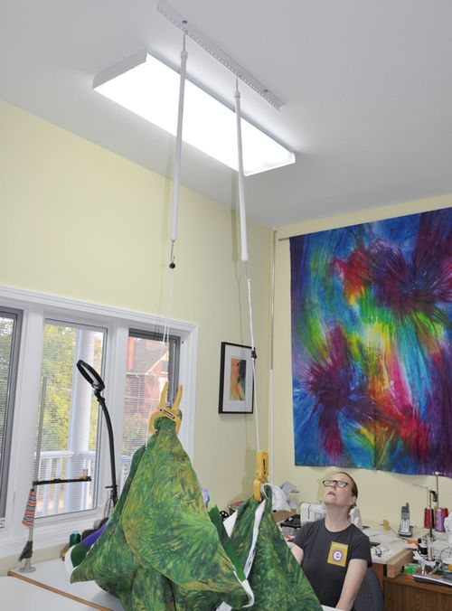
I first got the idea from Caryl Fallert-Gentry. Here she is at her machine:


QuiltPulley-01 copy

The idea is to use two quick-release clamps suspended from the ceiling to hold the weight of the quilt off of the table while you work. Her studio ceiling is very high so she added two metal poles with hooks on either end. I have 8′ ceilings so did not need the poles.

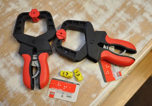
Here are the supplies you need:

  • 2 quick-release ratcheting clamps. Don’t get regular clamps with springs only—hey are hard on your hands.
  • 2 jacket-toggles—that’s what those yellow things are
  • Several yards of nylon cord—the kind you would use in a Roman shade (not shown) 
  • 2 big, eye-bolts for the ceiling (not shown). It’s a lot easier if you can screw them through the sheet rock, into wood. Otherwise you are going to need to look for something with a toggle.


QuiltPulley-02 copy

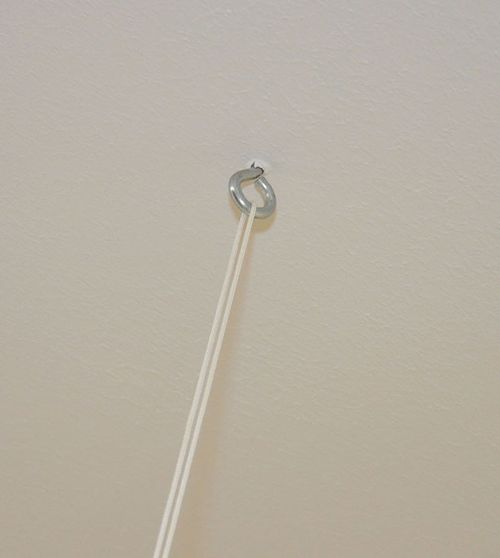
Here is what one eye-bolt looks like in my ceiling. This one measures about 7/8″ across.


QuiltPulley-05-750

I have a Sweet Sixteen. It sits in a table, front to back, not side-to-side like a home machine. My eye-bolts are positioned in the ceilling about 30″ apart, centered over the machine—one on one side, one on the other. They sit back from the front of the table about 12″.

If you machine quilt on a home machine, position one bolt (in the ceiling) behind the needle, about 12″. Position the other one 14″-16″ to the left of the needle (in the ceiling). 

Cut a length of nylon cord twice the length from your tabletop to the ceiling. That will be too long, but you can cut off the excess later.

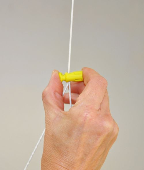
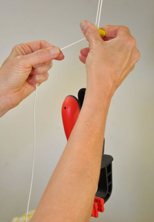
Squeeze a jacket toggle open and run one end of the nylon cord through it and then up through the eye-bolt in the ceiling. Run it back through the squeezed-open toggle.


QuiltPulley-06 copy

Tie one end of the nylon cord to one handle of a quick-release clamp. My clamps came with holes that were perfect for this. You might have to drill a hole.

To raise or lower the clamp, squeeze the toggle and pull the other end of the cord. As you use the clamps, you will figure out how much of the excess nylon cord you want to cut off. I like to be able to reach it from a sitting position.


QuiltPulley-09 copy

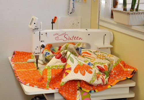
In the photo below I don’t have the clamps attached to the quilt. The weight of the quilt is on the table and hanging ove the edge. It is harder to manage.

SweetSixteen-01 copy

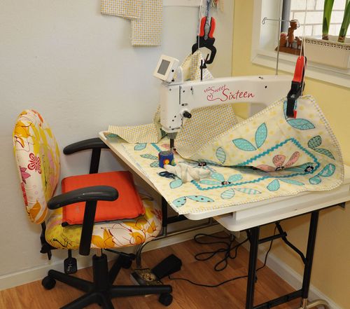
In the next photo I have portions of the quilt clamped and held up off the table. Somtimes my quilts look this tidy on the table but mostly they don’t. I don’t always clamp the outer edges of the quilt. On big quilts I have to clamp areas more in the center of the quilt.


SS-WithClamps copy

I change the position of the clamps often as I have to as I move and turn the quilt. It’s easy and fast. The more you work with them, the easier it is to know where best to clamp the quilt.

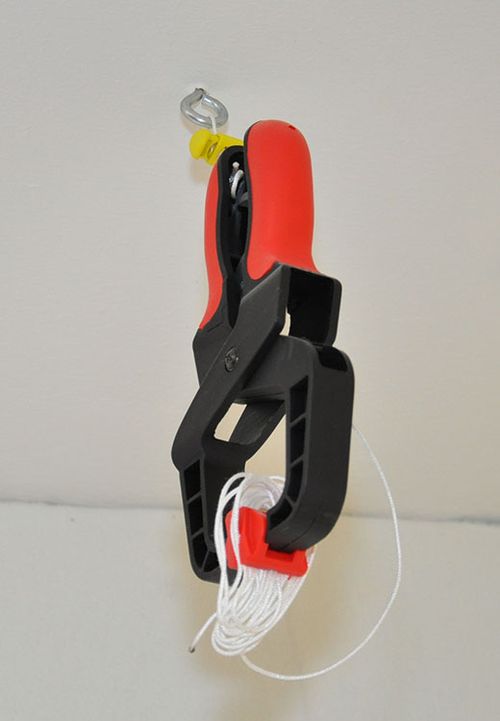
When I’m not using the clamps, I pull them up to the ceiling and clamp the coiled excess cord.


QuiltPulley-10-750

So there you have it! This is an inexpensive and simple way to control your quilt as you machine quilt. I hope you have as much success with this as I have!


And the winner is…

Congratulations to Lynn, whose blog you can see here! Her number was chosen randomly by my MIL, Edith. I hope you enjoy making your own wonderful North Pole quilt :-). 

I want to thank all of you who commented and wrote such nice things! These designs have always made me smile and it's nice to know that they make you all smile too. If you are looking for a copy of the book, you can find it here on the Piece O' Cake website.

There are two other small projects in the book. They are cute and give you an idea of other ways to use the designs. 


North pole wall quilt 2


North pole snowflake

Christmas is coming, and I have a surprise for you!

Guess what came in the mail today? A package from That Patchwork Place to let me know that Welcome to the North Pole has been reprinted. Yay!


NPCover

This is a happy book! The blocks are easy to personalize and make your own which must be why this book is still well-received even though it was first published in 1997. I am both happy and proud that these designs are as relevant now as they were then. 

That Patchwork Place sent me a new copy of this book and I think that one of you should have it! Leave a comment below and a winner will be chosen randomly on Saturday (9/21/13). Be sure that you either leave your email as part of your comment or check back to see if you won. If I can't find you, I can't contact you to get your shipping address.

In other news, Christmas is coming and I'm not ready :-). More on that as time goes by.


Blue on blue…

I have always been told that quilters buy more blue fabric than any other color. I never did – I always bought more green. I bought red, and then blue. 

Over the last several years, that changed for me and I attribute that to the introduction of the first, colored iMacs. Do you remember when desktop computers were uniformly gray and hideous? I do. And then Apple gave us this…

BlueberryiMac-01

(Photo by Heather Robinson, taken especially for me! Thank you, Heather!)

Oh happy, happy day! Not long after its introduction, the blueberry iMac was followed by other candy-colored iMacs.

I lusted after the aqua iMac but never bought it because I already had a higher-powered mac and did not need this new one. Our son, Chris, did end up with a green iMac (because I could not make him want the aqua one that was, by far, the best color) when he went to college. Boy, that dates us both :-).

I did not get over aqua-iMac-lust and aqua started turning up in my quilts. Over time, aqua has become my go-to color. That said, I have had trouble combining some shades of blue. Specifically blue-jean blue with aqua. The periwinkle-ish blue jean color always felt off when I tried to wear (or pair) it with aqua.

But I am getting over that because I have been paying attention to the way these shades of blue live happily together in the real world:

BlueSky-TurqOcean-01

Whether natural colors (above) or man-made colors (below), these different shades of blue are happy together.

SouthwestBlueAndAquaJetbridge copy

It's funny how one thing leads to another, isn't it? And how, over time, you can look back and see what sticks with you. (Who remembers what doesn't stick :-)?)