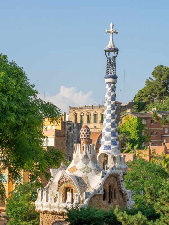
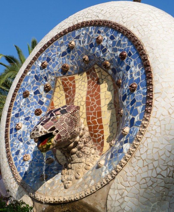
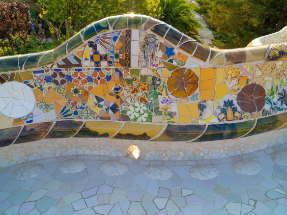
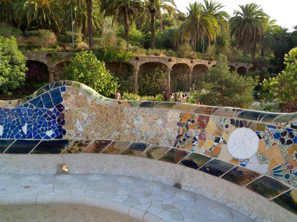
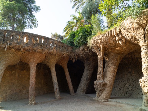
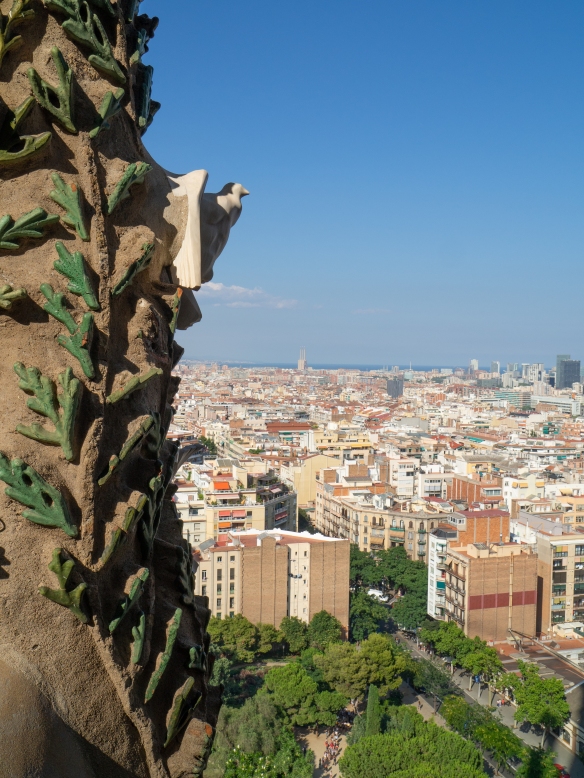
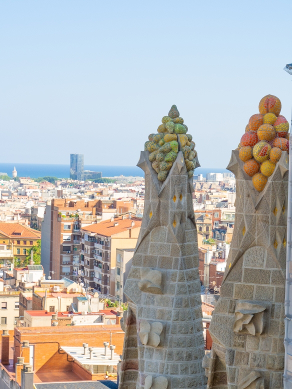
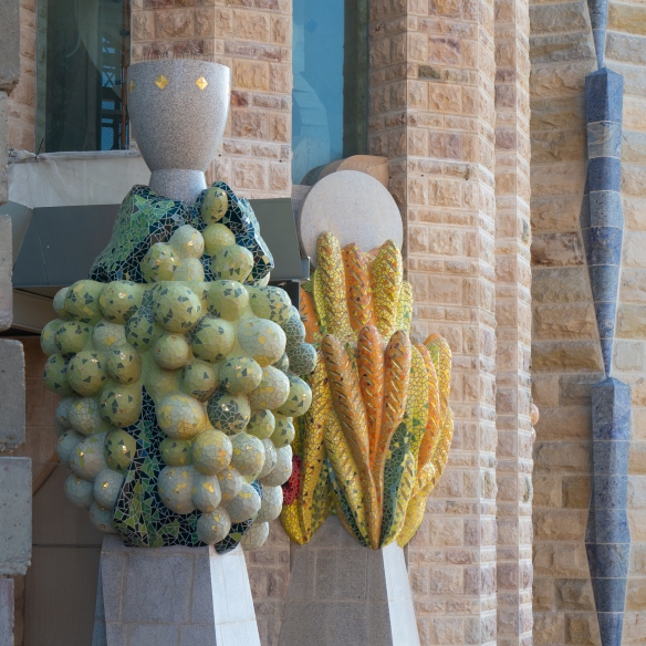
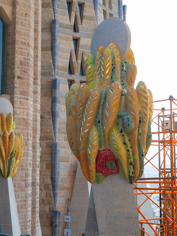
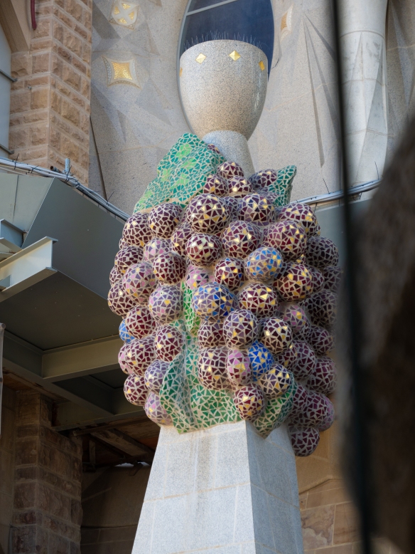
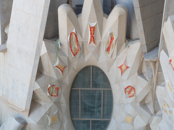
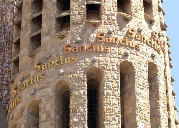
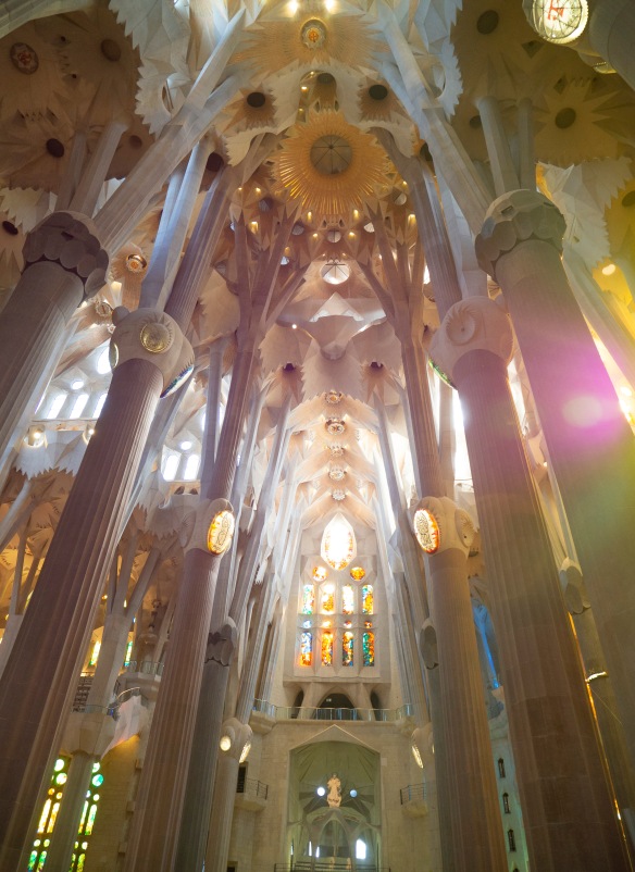
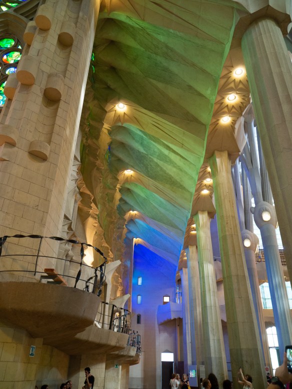
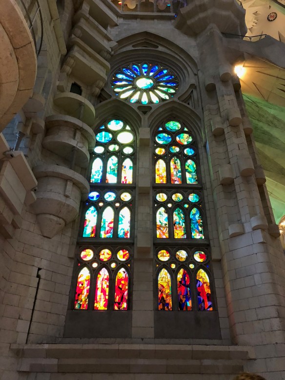
I’ve shared many photos of our trip to Spain, but I haven’t said much about how what I saw is working its way into my head design-wise. I was definitely inspired by the color, freedom, and spontaneity evident in Antonin Gaudi’s work. The color and playfulness, combined with a deep understanding of form and function, will stay with me.
But there is more to Spain than the work of Antonin Gaudí. I paid particular attention to the colors of the buildings in all of the cities and villages that we visited.

The colors are generally warm, and tend to be light to medium in value. The overall palette is loaded with beige-neutrals, warm grays, pale yellow to gold, peach, salmon, and pale greens…
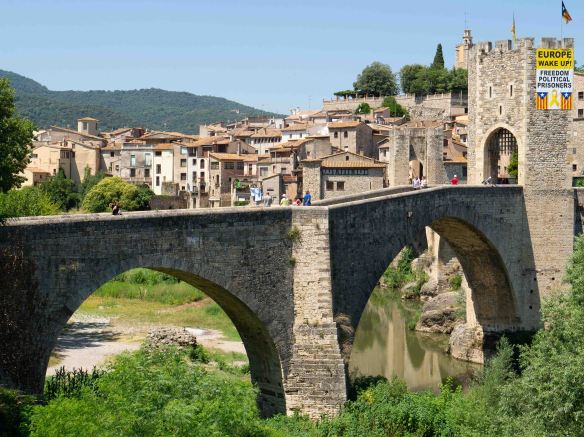
If you are like me, you have stopped noticing what you see every day in your own home town. It’s so much fun to look around and see something new everywhere you look!
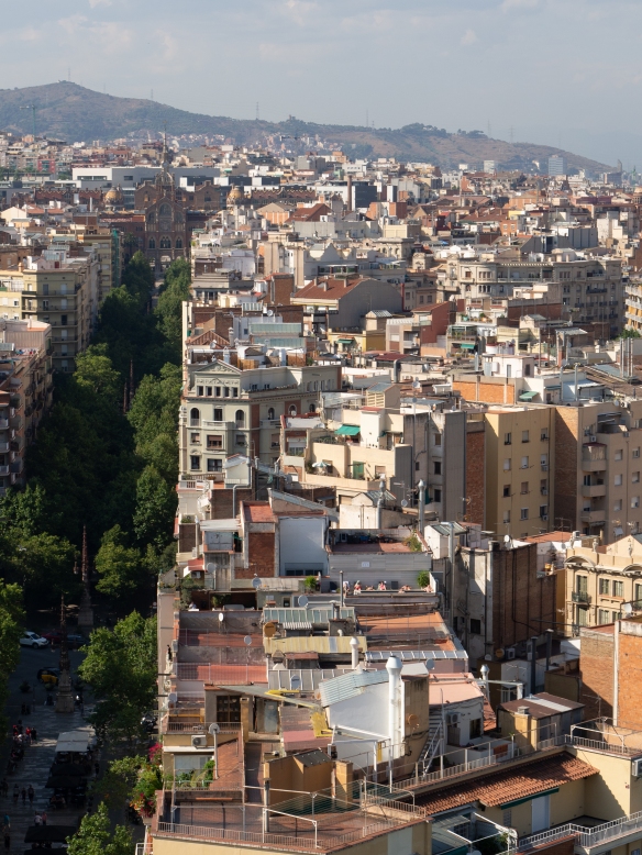
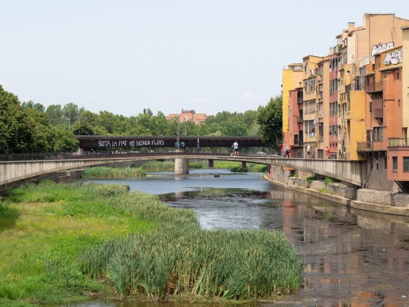
Even the back side of a block of basic apartment buildings is interesting to look at.

White walls and buildings were less common, but they sparkle when you find them.

Strong, dark colors were rarer and stood out from the crowd. There are probably lots of deeply colored buildings, I just didn’t find them.

Gaudí’s mosaics are the most famous, but they are not the only mosaics to be found. These columns can be found in the Palau de la Música Catalana designed by Lluís Domènech i Montaner.

I saw more white walls in the coastal villages. And a lot more blue… blue doors, blue trim, blue water.


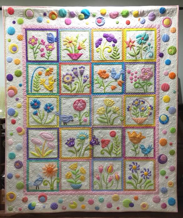
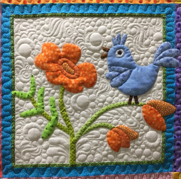
As I think about and remember the places we visited on this trip, I see these colors in my head. I’ve begun drawing my next quilt and I know that at least some of this warm and lovely color palette will be in it.