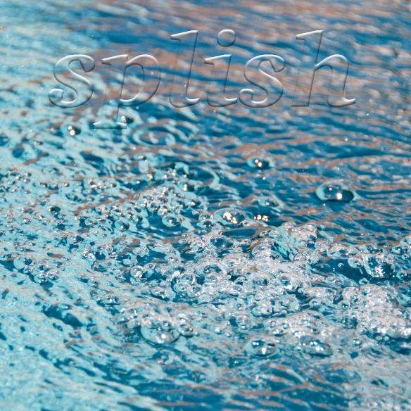
I’ve written before about the 52 Week Photo Challenge online class that I’m taking from Ricky Tims. Best class ever! This week’s assignment is how to add a text overlay to a photo.—yet another cool thing that you can do in Photoshop that I had no idea existed.
I’ve taken 3 photos (Splish is one of them) and I like them all. If you have a bit of time, please do click here and then leave a comment on this post telling me which one you like the best.
Choosing the word(s) was the hardest part of this photo challenge. The same thing is true when you add words to a quilt, as I wrote about in this post. Text is powerful. It draws the eye and, no matter how big or small it is, what you say can dominate a design. The quilt that I made after that post is called Say Something (below), which is in The Quilter’s Practical Guide To Color.

The words take up a small percentage of the space on the quilt, but they are the focal point, dominating the design. This is good to remember when you want to make what may be a simple quilt into a more complex statement.
Update: Thank you all for your comments! I’ve decided to submit the car photo because I like it as is. After reading your comments, I think I need to make the word “splish” more legible in the water photo and I don’t have time today to do that. So, the car photo it is and I can mark that off the list. Thanks!


