World Series Quilt – Post #3

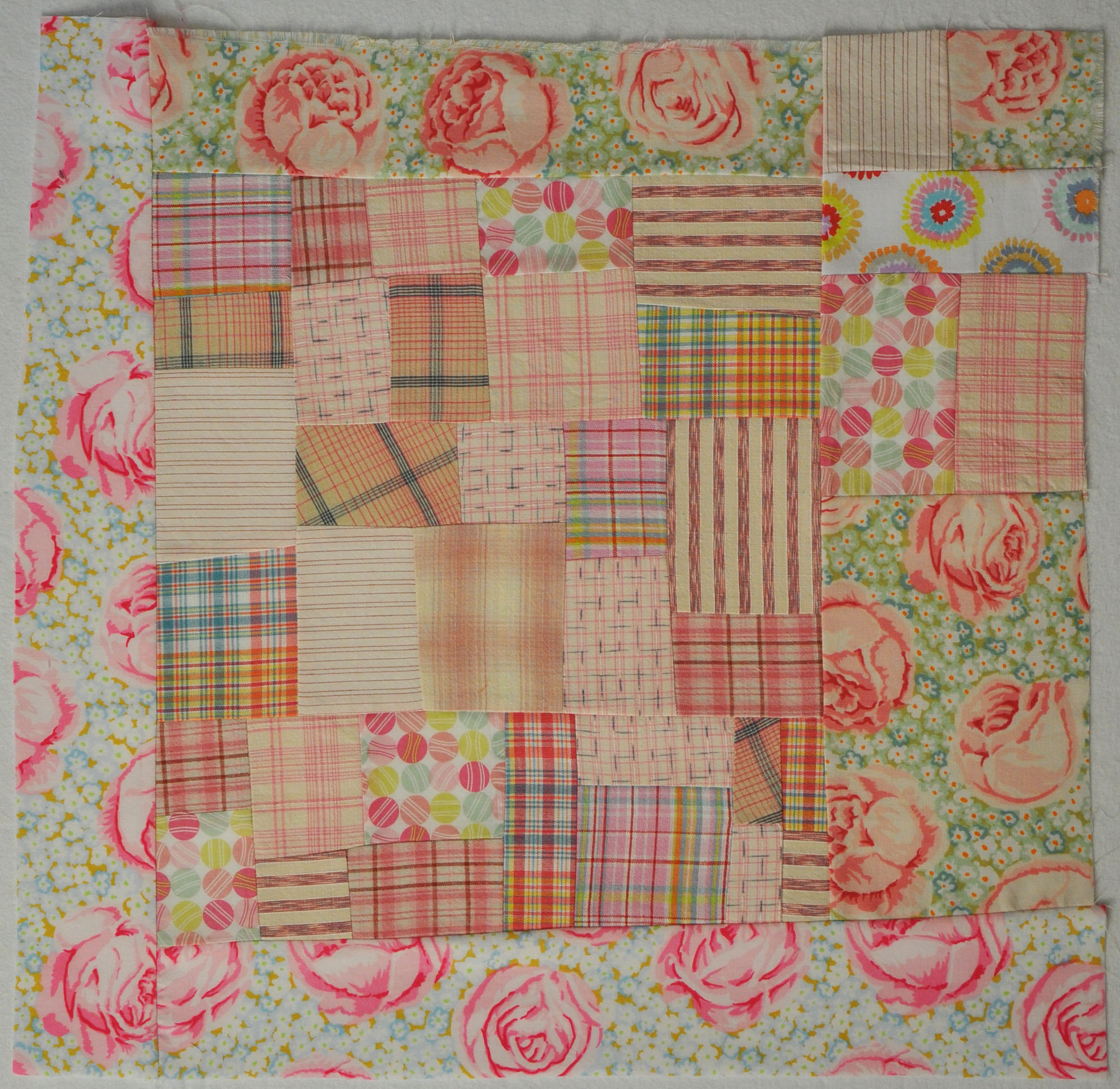
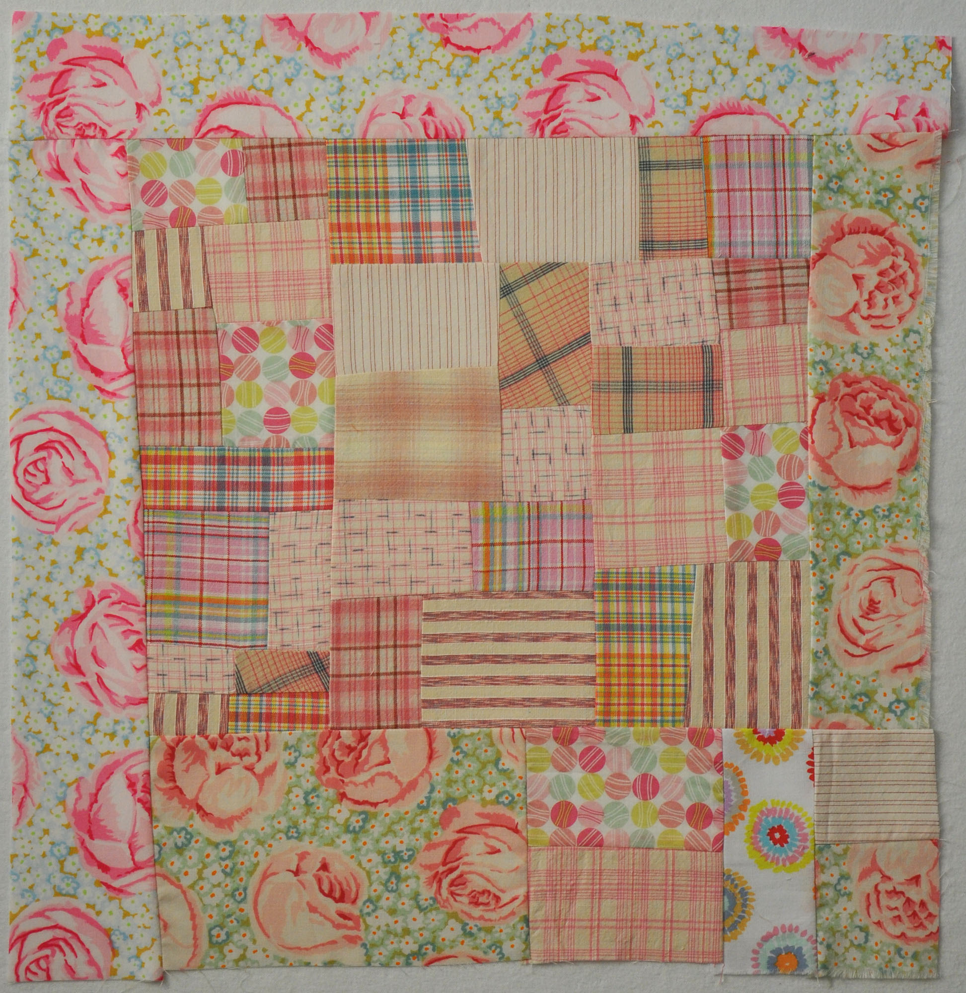
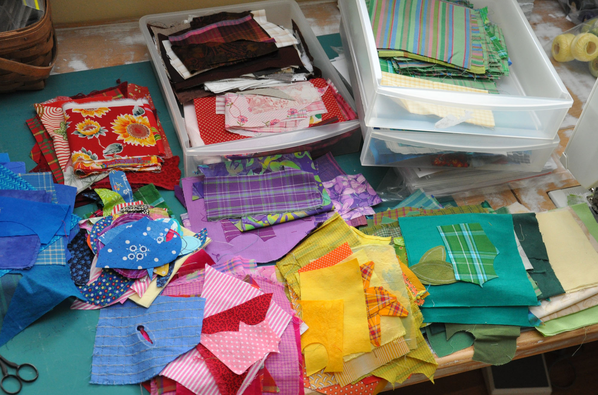
I decided that I would choose the applique fabrics for this quilt from my 3 little drawers of scraps – rather than carefully choosing the fabric from my stash. I began by sorting the various bits into their color families.

WorldSeries-04 

I've also decided to work without a 'real' pattern. I've got my preliminary sketch and the vision in my head. I'm cutting the pieces by hand, no templates, no lines on the fabric. I'll eye-ball the the seam allowances and finger-press it under as I go.

Why am I working this way? From a design standpoint, I'm trying to capture what it might be like to make this quilt if Alzheimer's was taking away my skills. But I'm also 'working without a net' because it is a real challenge and I enjoy a challenge.

"When I am empty of my memories – please pick them up and keep them safe
for me." This is the idea I am building my quilt on. I want it to feel empty in the center. Is empty dark or light? I started with off-white petals on the central flower. They disappeared into the background, which I expected but wasn't crazy about. For now, empty is dark – like a black hole. The flower center may go dark or stay light – it's going to depend on how the quilt builds around the center.

WorldSeries-03

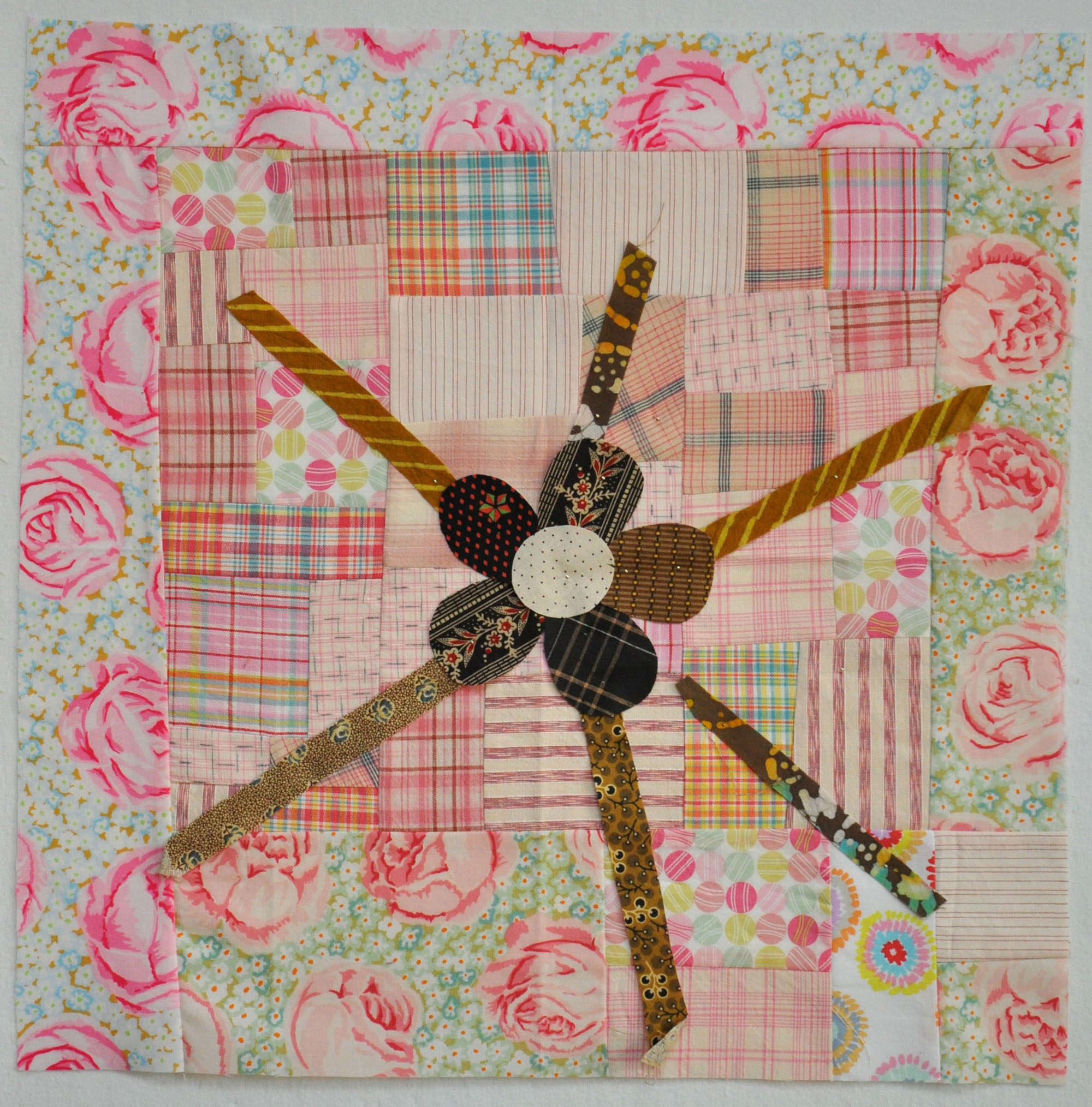
As I have spent time looking at the photo, I think I need to flatten out some of the curves on the dark petals, making them less flower-like…

Are we a cute couple or what!?

BeckyAndSteve-05-2010_01Our church is in the process of putting together a new directory. The Lifetouch photographers set up shop in the parish center and we had our photos taken a few weeks ago. Surprisingly enough there were a couple of really good ones of us together, and of us each separately as well. (I say 'surprisingly' because we had very low expectations going into this. We almost wore jeans!)

I'm not usually a fan of posed photos, but I really like this one – in black and white. The color version was just OK. This is something I'm going to remember – just because a photo starts out in color doesn't mean it has to stay that way.


World Series Quilt – Post #2

I got an email reminder from Ami that my World Series quilt HAS TO BE IN HER HANDS BY AUGUST 1ST. It’s as if she knew that my foot is enough better that I can stand for short periods to cut, iron, and sew. So I got to work Monday and constructed the background.

A friend suggested that this quilt be pink. Since that’s the primary color of the quilt I made for the traveling exhibit I thought that made sense. I like pink and, more importantly, it feels right for this quilt. Pink feels hopeful and there is a kernel of hopefulness in the sentiment I am trying to convey (click to go to my first post about this quilt).

BaseballChallenge-02

Usually I build this sort of block on the wall but because of my foot, I
looked at it flat on my table during construction. I was glad when I
put it on the wall that it looks the way I intended it to. The actual
block is a little lighter than it looks here but it is still an active
background. My intention is to put strong colors on top of it and that
will push the background back.

The next question is which side is up? I looked at it four ways. Below it is turned once, clockwise…

BaseballChallenge-02 copy1

Turned once more, clockwise…

BaseballChallenge-02 copy2

And again…

BaseballChallenge-02 copy3

When you piece backgrounds, especially ones made from a variety of
fabrics, it’s a good idea to look at them turned different ways. What you thought was ‘up’ may or may not be the best orientation.