Show and tell…

SusanAhmad

Susan Ahmad sent me a photo of her finished Tile Tango quilt—it’s lovely! She told me that she is an avid gardener with a special passion for day and Asian lilies. This flower design felt lily-like to her so she matched the colors of her lilies with her flower fabric, except for the blue. She says she’s still hoping to grow a blue lily.

Susan altered the setting from my original quilt (Tile Tango from The Quilter’s Practical Guide To Color) removing the corner triangles and adding sashing. It’s a very good look. You know that there is nothing wrong with changing a pattern to suit yourself. Personally, I enjoy seeing how you all make my designs work in your quilts so please do send pictures :-).

Thank you, Susan, for sharing you quilt and the story behind it.

Amy Marson, on embroidery…

My good friend, Amy, offered share more about her embroidery art. Yay!

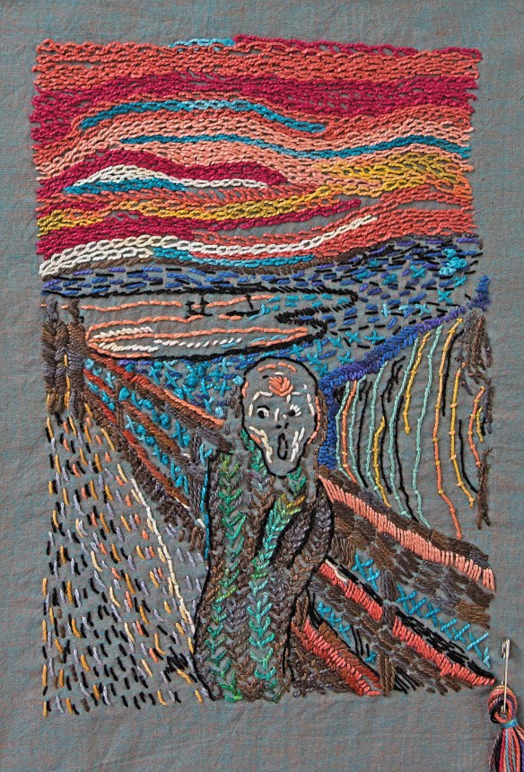
Do you spend a lot of time commuting? passenger in a car? on an airplane? I do! And I am fidgety, always needing something in my hands to keep me busy.  Well last April I started embroidering when I travel and I am hooked. I have done two famous paintings, The Scream and Starry Night. My favorite part of both of these is the sky done in a big chain stitch.

Amy_StarryNight-2

I am fairly new to embroidery and I like it when my work looks a bit rough (I am a recovering perfectionist) and not precise.  I really enjoyed trying to figure out what colors to use where and how to make certain sections stand out. I made different choices than the artists just for fun and I am really happy with the results.  My Starry Night hangs next door at my neighbors house (a Christmas present) and I am not sure yet what to do with The Scream. I may keep it…

Amy_The_Scream

A few good things to note. To transfer the pattern I used C&T Publishing’s Wash-Away Stitch Stabilizer, a great surface that you can run through an ink jet printer and adhere to your fabric while you are stitching, and when you are done you swish it in water and it melts away!

I got some great needles from Becky (this is a good set) and used a variety of perle cottons (lots of choices here) for much of the designs. I love how the perle cotton sits on top of the fabric. Also, I did not stick with one weight of Perle Cotton, I used three different weights, my goal was to create a lot of texture and I think it worked.

I am a self taught stitcher using Judith Baker Montano’s Embroidery & Crazy Quilt Stitch Tool and I work very quickly with the goal of done is better than perfect. What am I working on now? I sketched a world encircled by houses, trees and a book. I started freehand stitching and it is coming along beautifully! If Becky let’s me guest post again I will show you my latest project. Until then, needles up!

Amy

PS from Becky: Amy, you can guest post any time!

Color(s) of the year…

I’m busy working away on the next new thing that I can’t tell anyone about for months. It is ever thus. BUT, as I’m working, I can’t get these colors out of my head.

First, did you see the Kona Cotton color of the year announcement? The color is Tiger Lily and it does make me happy.

Kona-TigerLily.jpg

Click here to see the Robert Kaufman Tiger Lily Look Book. It’s full of designs from their designers using this color.

A few days later, I became aware of Pantone’s color of the year, Ultra Violet. Who knew, right? I remember when there was one color of the year and that was that.

Screen Shot 2018-01-25 at 3.36.59 PM.png

Do you remember last year’s Pantone color of the year? It was Greenery…

RX_Pantone-Color-2017_Greenery.png

These 3 colors form a triadic color combination that is both lovely and not often used: purple, orange, and green.

Triadic-PurpOrangeGreen.jpg

I’m hoping that now that I’ve shared this with you, I can stop thinking about these 3 colors because it’s very distracting when I need to be thinking about other colors :-).


My favorite white pencil is famous!

I have used a white charcoal pencil made by the General Pencil Company for as long as I can remember. They are the perfect pencil for marking medium to dark fabric AND they are very affordable! You can find them here and here on my website.

Imagine my surprise when I saw a feature story about General Pencil today in the New York Times! It is a great story, with amazing photos by Christopher Payne, that tells us how pencils are still being made in the US.

14mag-pencil16-superJumbo.jpg

I’m even more impressed now at both the quality of every pencil and the low prices!

14mag-pencil19-master1050.jpg

Click here to read the article in the New York Times.

Do you understand your printer settings?

I have a lot of ePatterns and eBooks at pieceocake.com. It is important that the patterns are printed out at the right size. To do that you have to be sure that your printer settings are correct. I can help, with pictures.

NOTE: I have a Mac so my printer box may look a little different from yours but I think that the basics are the same.

When you hit ‘print’, a window opens:

Screen Shot 2017-07-27 at 9.05.14 AM

Look at the options under Page Size & Handling. Your printer will have a default that may not be what you want. In this case, you should click ‘actual size’.

Screen Shot 2017-07-27 at 9.05.49 AM

Next, look at the image that shows the page and the margins around it. My picture shows too much margin. I can fix that!

Screen Shot 2017-07-27 at 9.05.58 AM

Look for the ‘page setup’ button and click it:

Screen Shot 2017-07-27 at 9.06.12 AM

See where it says ‘any printer’? Click that:

Screen Shot 2017-07-27 at 9.06.24 AM

The list of printers opens. Click  on your printer to choose it and then click OK. You might notice that the first window also lists my printer but for whatever reason I have to go through this step to make the margins smaller.

Screen Shot 2017-07-27 at 9.06.50 AM

Now the picture on the print page shows smaller margins. This does not shrink or enlarge the final print out. What it does do is not cut off the edges of the page when it prints. This is important when you are printing the patterns because of the way they fit together.

Screen Shot 2017-07-27 at 9.07.10 AM

I hope this helps you in all of your printing 🙂

Fabric love at first sight…

IMG_0095

I love Alison Glass‘s fabric. That’s a fact.

You know that the fabrics in any collection, by any designer or from any company, are designed to work together. I have found that even though I may like a collection, there are only a few fabrics that I actually use. It is a rare thing to find a collection of prints where everything works together as well as these fabrics do. Why is that?

  • In addition to being just luscious, there is a nice mix of values.
  • These particular prints add texture without being distracting. That works really well in both piecing and appliqué.
  • There are both clear colors and gray colors. When used together, clear colors come forward, grayer colors recede. In a quilt, the combination of clear and gray colors adds dimension to the design.

This is what I have right now: a mix of Alison’s Chroma and Handcrafted Indigo collections as well as a text print. It’s a great start but I know I’m going to be adding more AG fabric to this mix because more is obviously better in this case :-).

AlisonGlass-03

If you’ve been reading my blog, you know I’m working on a foundation paper pieced quilt. The first quilt top is sewn and I’m now making variations of the pattern in AG fabric. I don’t want to ruin future surprises but this gives you an idea of how these prints work together in a pieced block.

AlisonGlass-07

One last thing: When I was in St. Louis last week I picked up some give-away scraps of vintage fabric from the guild table. Too many quilters are nervous about mixing vintage-style prints with modern prints. Don’t be! This is a happy stack of fabric that would make a great quilt.

OLYMPUS DIGITAL CAMERA

I don’t often go on and on about fabric on my blog, but these prints are special. You should consider adding them to your stash.

Happy fabric shopping (is there any other kind?).