I love Alison Glass‘s fabric. That’s a fact.
You know that the fabrics in any collection, by any designer or from any company, are designed to work together. I have found that even though I may like a collection, there are only a few fabrics that I actually use. It is a rare thing to find a collection of prints where everything works together as well as these fabrics do. Why is that?
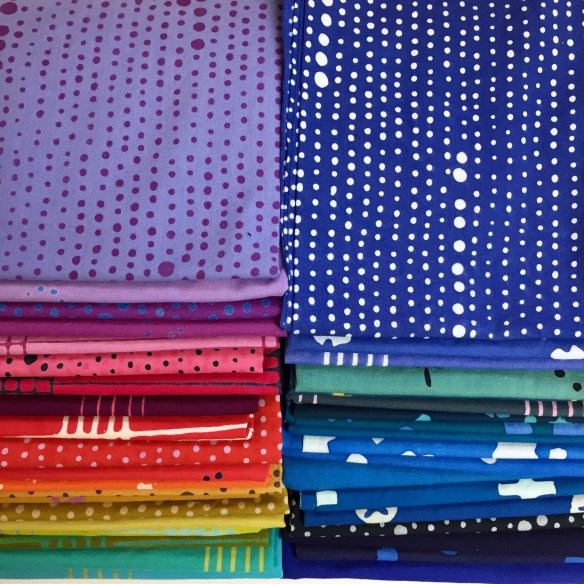
- In addition to being just luscious, there is a nice mix of values.
- These particular prints add texture without being distracting. That works really well in both piecing and appliqué.
- There are both clear colors and gray colors. When used together, clear colors come forward, grayer colors recede. In a quilt, the combination of clear and gray colors adds dimension to the design.
This is what I have right now: a mix of Alison’s Chroma and Handcrafted Indigo collections as well as a text print. It’s a great start but I know I’m going to be adding more AG fabric to this mix because more is obviously better in this case :-).

If you’ve been reading my blog, you know I’m working on a foundation paper pieced quilt. The first quilt top is sewn and I’m now making variations of the pattern in AG fabric. I don’t want to ruin future surprises but this gives you an idea of how these prints work together in a pieced block.

One last thing: When I was in St. Louis last week I picked up some give-away scraps of vintage fabric from the guild table. Too many quilters are nervous about mixing vintage-style prints with modern prints. Don’t be! This is a happy stack of fabric that would make a great quilt.

I don’t often go on and on about fabric on my blog, but these prints are special. You should consider adding them to your stash.
Happy fabric shopping (is there any other kind?).

