Black, white, colors…

I go through periods where I buy black/white prints in larger numbers. My recent shopping trip was no exception…


BlackPile-GrayPile copy

I also bought several gray prints. I separated the cleaner b/w prints from the gray prints into the two stacks you see above. (There's more on 'clarity' at the bottom of this post.)

I don't have a project in mind for them, but I know that I could make a quilt with just these neutral fabrics or I could add color to them.

I thought you might like to see how some of the other new fabrics could mash up with the b/w stack and the gray stack.

Here are the greens with the b/w stack…


Black-Greens copy

…and the same greens with the gray stack.


Grays-Greens copy

The clarity of the greens shift subtlely depending on which stack they are paired with. With the cleaner b/w prints, the greens look a bit brighter to my eye. The grays make the greens look a little duller.

The same thing happens with the yellows and oranges…

 
Black-YellowOrange copy


Grays-YellowOrange copy

I think that a lot of the problems quilters have with 'color' might begin with clarity issues. So many of us have both clear and gray colors in our stash. Some of them look nice together but other combinations look so bad that they make your teeth hurt.

The key to combining clear and gray colors comes from understanding how they work together. In general, gray colors recede and clear colors come forward. Combining the two can give your quilts more visual dimension. But, as you well know, you can't throw just any colors together and expect them to be  wonderful. 

Colors live on a sliding scale, from clear to gray. Colors at the far ends of this spectrum are harder to use together (imagine lime green with civil war pink—yuck). You will be more successful if you combine colors closer to each other on this sliding clarity scale. 

So why do the colors (in the photos above) work with both the b/w prints and the gray prints? In these cases, the black/white and the grays are neutral foils for the colors. The cleanness, or grayness, of the neutral stacks have an effect on the clarity of the colors next to them.

Color, value, clarity—all are relative. Every color is effected by what it is next to. Context counts.

I hope that makes sense :-). I've been writing about this very thing in the color manuscript for two days!


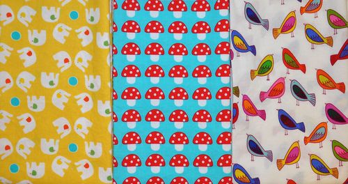


Why I bought what I bought, continued…

In the past few years, there have been some really nice prints that are designed to be used from selvage to selvage. I don't buy them all but this one, with the birds and the dots, is one I couldn't pass up. I like the collaged look of it. The birds only run along one selvage edge. I may end up using it on the back of a quilt which is fine. I like the back to be fun, too! (This is by Carrie Bloomston, Collage collection, for Such Designs.)

BirdDot copy

I don't use many prints with 'things' on them in but that doesn't mean I never buy 'thing' fabric. I just don't buy much of it.  


Things copy

I bought the mushroom print because of an art professor (Mary) that I took printmaking from many years ago. She would sometimes talk about "art" that included polka-dot mushrooms made by crafters. I don't remember her being ugly about it—more that you shouldn't rely on kitsch in art.

I think about Mary every time I see dotted mushrooms :-). I think it would be fun to sneak a bit of this fabric into my quilts. Just because.

In the black and white section of the store I found more graduated prints. The gray zigzag is dark at both selvages, light at the fold. The two dots are stripe-y. I have no idea where I will use them, but these are good to have in the stash because they are rare.

GraduatedPatterns copy

And then I bought 1-1/2 yards of this: 


GrayLamps copy

I do not know why I like it. I'll probably use it on a quilt back—or not. Who knows. The print feels big, the lamps (or onions? or beads?) are 2-1/2" wide. It is designed by Jane Dixon, the collection is called Poppy Modern, for Andover.

Wait… poppy? How about that! Turned upside down it does look like poppy seed heads—except that I still see the hanging lamps.


GrayLamps-Poppy

FYI: If you see any of these fabrics you like, contact The Quilt Asylum. They may have more.


Why I bought what I bought…

Two things you should know:

  1. I don't shop for fabric that often. I shop when I find myself at a quilt shop and that's not nearly as often as you might think. When I travel, it happens sometimes. When Linda is here, we go to the Quilt Asylum. Other than that, I work out of my stash. But every now and then, the stash needs an injection of new fabric. I rarely have buyer's remorse after a shopping trip.
  2. I don't buy fabric for specific projects. If I have a quilt in the planning stage, I look for fabric that could work in it, but I don't shop for specific areas of a quilt. What I mean is that I don't look at a fabric and think: "I will use this fabric for that square."

In my last post I explained why I bought so much 'text' fabric—I like the visual texture. Why did I buy so much red?


WhatIBought copy

I need to make a monochromatic quilt for the color book. That would be a quilt made from only one color. To do that you need many values of that one color: lights, mediums, and darks. 

To be specific, I am talking about fabric that has only one color in it—no 'extra' colors added to a print. You can buy solids and tone-on-tone prints in values from light to dark in green, blue, purple, yellow, orange, etc.—and the colors are still recognizably those colors.

What happens to red when it gets light? It goes pink. Or orange. Very dark reds lean toward blue/red or orange/red. Making a truly red monochromatic quilt is kind of hard—so that's the one I'm going to make for the book.

I have not been able to build a light to dark, fire-engine-red stack of fabric in solids or tone-on-tone prints because there isn't enough value difference without a color change. I can do it with prints, but only if I accept that white can be added to red. Tell me this: Is that cheating? 

I want this quilt to read 'red'. I am not going to use red and white fabric that has any 'extra', accent color. (That doesn't mean that I didn't buy any red/white fabric that didn't have other colors—I'm just not using them in this monochromatic project.)

The very lightest of the fabrics you see in my stack almost read more white than red and my plan is to use very few of them. 


Reds-01 copy

I love that stripe w/little dots on the right so I bought a yard of it. It might be used in the quilt, or not. It would be a great binding on this or another quilt.

The stack above is arranged in a lovely gradation from dark to light. Now, look at the same fabric stacked side-by-side, dark against light:


Reds-02 copy

I know I'll want to use more fabric from my stash in this quilt—that's what I was thinking when I bought these fabrics. I have no idea what the quilt pattern will be. Probably it will be pieced because I don't have much time left to make another applique quilt. But this is a good start! 


Where did the week go?

You might have noticed that I haven't posted for a week. I was laid low by a sinus infection for a couple of days and then Linda came for a working visit. 

Linda came for a visit because she is out of stitching—oh my! She came to Texas so that I could draw her next group of projects. It's so much easier to get the drawings right when we're together. She knew what she wanted but as the drawings progressed, ideas changed. It's always a little slow going in the beginning but, after 2-1/2 days, we were done. Yay!

During that time there was the usual hustle and bustle in my house. Lorna was here to fill orders, the kids were here with her… Linda told me that now she knows why I am sometimes stressed when we talk on the phone :-).

I love my grandkids and Lorna has to bring them with her when she works, but it can be hard for me to think when there is so much going on around me. However, I really want Lorna to come work! While Linda was here, I had an idea (or maybe Linda had the idea): I am going to pay/bribe Jack to play quietly when he's here and I'm working. He would love to make $1 a day and I would love to focus—it's a win/win, don't you think? I'm going to the bank on Monday to get a stack of $1 bills.

After the drawings were finished, Linda and I had time to go shopping at our favorite Texas shop, The Quilt Asylum. We spent 2 hours—and about $450 each. I knew, as my pile grew, that it was not going to be an inexpensive trip to the quilt shop. 

People sometimes ask me how I choose fabric. As I was folding this group, I thought that could use this group as an example.

Here is what I came home with, washed/dried/folded and neatly stacked (click on the photo and it will open larger):


WhatIBought copy

Most of the fabrics are fat quarters. If you see more of an edge of any fabric, it's probably a yard. I bought a couple of 1/2 yard cuts and a couple of 1-1/2 yard cuts.

Notice that these are clear colors, not gray/muddy colors*. I use clear colors 99% of the time. I know that every one of these pieces is going to work with the vast majority of the fabric in my stash.

*If you have trouble imagining what a 'gray/muddy' color is—think civil war, or Thimbleberries, or Jo Morton quilts. It's not that those are bad colors. Rather, they are not the kinds of colors that I use. I don't buy them. I don't even see them in the quilt shops because I don't spend time looking at them. Really—they are invisible to me. If this is the palette you use, then the fabric in my pile above is probably invisible to you— and that is OK.

Look at the stack on the right (above). Half of it is green and the other half is split between orange, yellow, and brown. It used to be that I bought more green than anything else. In the last couple of years that shifted to blue. Look at the stack on the left—There is as much blue as there is green/yellow/orange/brown combined.

The black/white/cream/gray stack is tallest but that's because I bought bigger quantities of fabric with text on it:


Text-01 copy

I really like the texture of text in prints and this fabric is hot right now. If you like it, you should buy it because it's not going to be here forever.

I like text the way it looks in books and newspapers—black and white (or cream). Many of the fabrics above were available in color. I don't like them as much. However, there were a few colored 'text' prints that I liked and bought fat quarters of. I may be sorry that I didn't get more of the fabrics in the center stack.


Text-02 copy

So, this is an over-view of 'what I bought'. Over the next few days, I'll write more about specific choices. Have a lovely weekend!


And the winner is…

Congratulations to Lynn, whose blog you can see here! Her number was chosen randomly by my MIL, Edith. I hope you enjoy making your own wonderful North Pole quilt :-). 

I want to thank all of you who commented and wrote such nice things! These designs have always made me smile and it's nice to know that they make you all smile too. If you are looking for a copy of the book, you can find it here on the Piece O' Cake website.

There are two other small projects in the book. They are cute and give you an idea of other ways to use the designs. 


North pole wall quilt 2


North pole snowflake

Christmas is coming, and I have a surprise for you!

Guess what came in the mail today? A package from That Patchwork Place to let me know that Welcome to the North Pole has been reprinted. Yay!


NPCover

This is a happy book! The blocks are easy to personalize and make your own which must be why this book is still well-received even though it was first published in 1997. I am both happy and proud that these designs are as relevant now as they were then. 

That Patchwork Place sent me a new copy of this book and I think that one of you should have it! Leave a comment below and a winner will be chosen randomly on Saturday (9/21/13). Be sure that you either leave your email as part of your comment or check back to see if you won. If I can't find you, I can't contact you to get your shipping address.

In other news, Christmas is coming and I'm not ready :-). More on that as time goes by.