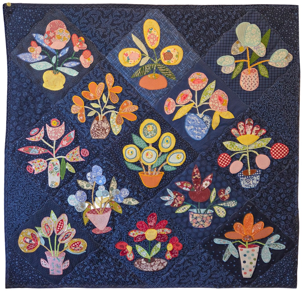
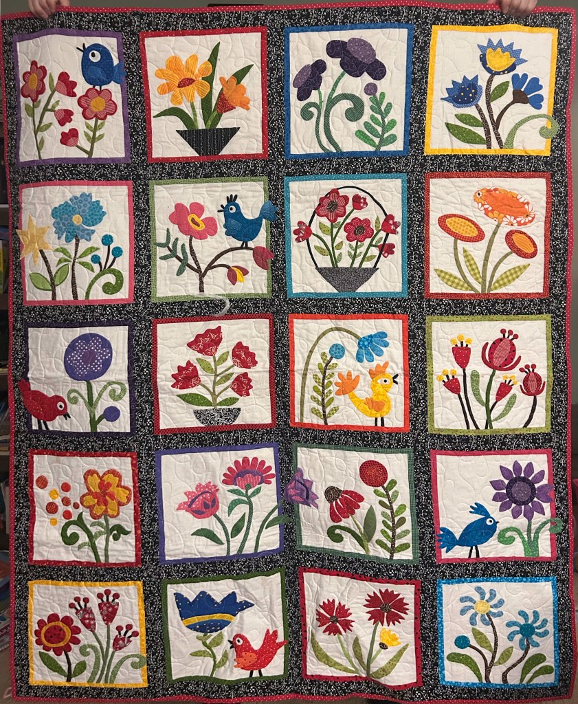
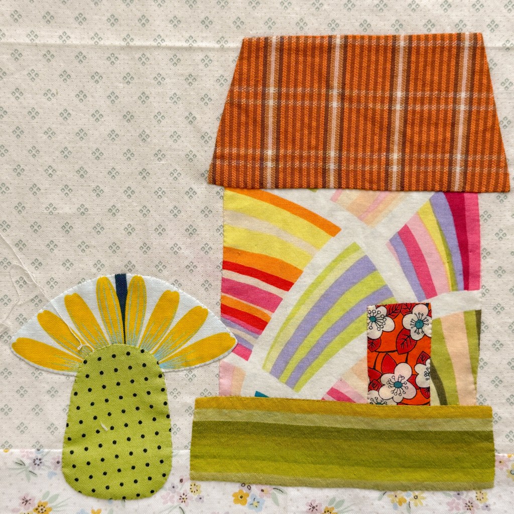
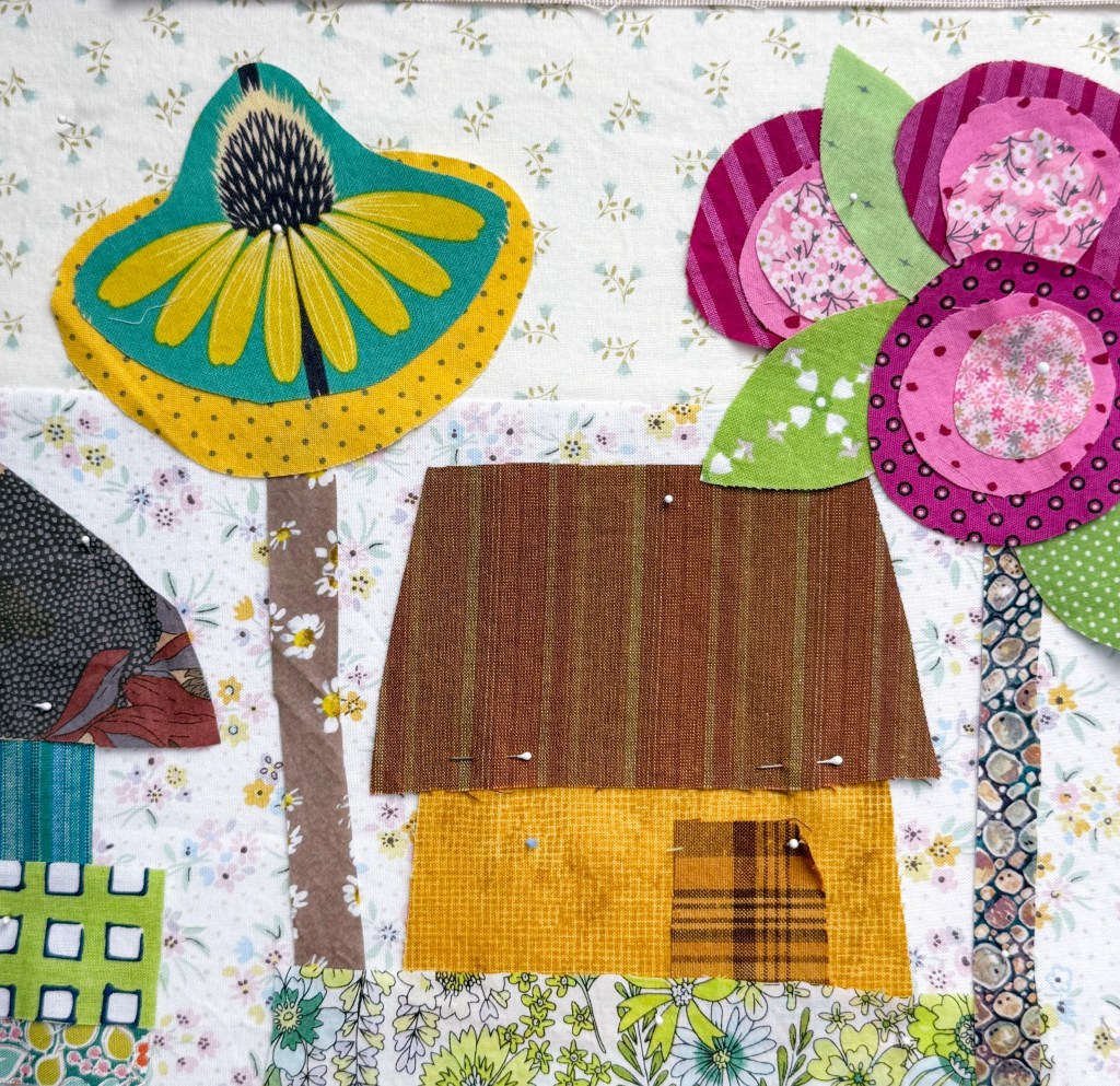
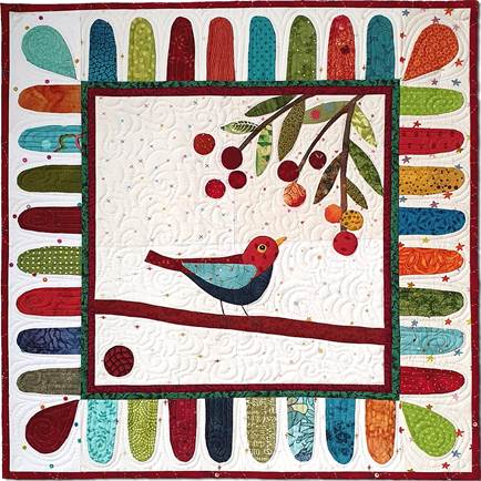
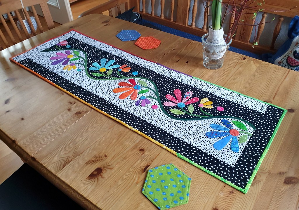
I am a quilt designer/teacher/author, a wife/mother/grandmother, and certified yoga instructor who is searching for balance, strength, and happiness in all things.
Kathy Sue sent me this photo of her finished quilt. It’s wonderful!
Kathy wrote:
I love your patterns, especially My Whimsical Quilt Garden!!!! It turned out adorable. It made me so happy, every stitch I took. I never made a quilt that was so much fun!!!!! Thank you Becky
Thank you, Kathy, for the kind words! I am so glad that making this quilt brought you joy 😊.
Anna Maria’s Zinnia print first came out years ago and since then it has been reissued in different colors. I love them all! Not sure which one I bought first, but it could have been this one:
Each flower is 3 3/4″ wide by 3″ tall if you count the stem. The spacing is tight in all the right ways. but I do wonder if some people shy away from it because the flowers are larger than your typical “small” print. Personally? I don’t mind one bit. As I said… I LOVE this fabric and have it in every color.
I haven’t pieced with it yet, but I will. I even have a stack of Kaffe stripes that would be perfect with these zinnias—later. When I have time. Right now I’m deep into Buttonwood Village and have already found three perfect places for a flower to sneak in.
The flower becomes a treeIs that a pineapple bush?The flower is a palm tree!
One flower becomes a tree. Another becomes a pineapple bush? And the third one could be a palm tree!
That’s the thing about bigger prints: if you avoid them, you miss out on so much fun. I encourage you to give them a try—you might be surprised where a big, beautiful print can take you 🌸.
Welcome to Buttonwood Village—my newest Block of the Month! I hope you are excited to get started and the place to begin is with fabric :-).
The first decision to make is your background, because everything else is built on top of it. I pieced my backgrounds from more than one fabric, but you may prefer to use just a single fabric—and either choice works beautifully. I chose a light, almost-solid off-white with tiny slubs of color woven in. From there, I added light blue prints (because… sky!) and a few light tan prints to give the background a little more visual weight.
For the border block backgrounds, I switched things up just a bit. I’m using a cotton/linen blend in a slightly darker tan. Since there isn’t an inner border strip in this quilt, that change in value—and texture—helps visually separate the border from the interior of the quilt. It’s a subtle shift, but an important one.
With the backgrounds settled, it was time for the fun part: coloring the village. I raided my scrap bins first, pulling out all those small, lovely pieces that I just couldn’t part with. You’ll notice there’s a little bit of almost every color in the mix—that variety is exactly what gives the village its charm.st colors.
Next, I visited my stash to fill in a few gaps and expand my color palette. I won’t use everything you see here, and I may add more as I go. This part is meant to be flexible and playful. Gather the colors and fabrics that you love, see how the colors talk to each other, and remember—you can always adjust along the way.
Once you have assembled the fabric, your village will be ready to come to life, one block at a time.
Houses have shown up in stitched work for hundreds of years, and that really isn’t a surprise. We live our lives inside houses. The people we love are part of our household. When we stitch houses, we’re often stitching feelings too—memories of homes we’ve lived in, homes we’ve loved, or maybe homes we’re still dreaming about.
Buttonwood Village is a happy place, built with a whimsical attitude and lots of color—and it truly feels like home to me :-). You might notice that the houses are small. Steve and I have never lived in big houses, so small just feels right in my bones.
And those giant flowers and trees? My yard doesn’t look exactly like that, but it is full of plants, flowers, and trees. This photo was taken last spring—by summer everything had grown taller, bushier, and a little bit wild. Just the way I like it :-).
Irina Stiop sent me some pictures from her Welcome to the North Pole quilt. I’m pretty sure you will want to see all of them, but let’s start here because Irina changed the positions of the blocks to make a quilt that is more horizontal than it is square. This fits her space better. Well done, Irina!
Notice that the moon is rising in the upper left and the top backgrounds are darker. This sets the stage nicely for a night flight by Santa Claus…
Irina wrote:
I used Autocad to rearrange the layout of the quilt to accommodate my horizontal space, some dimensions had to be slightly changed.
I used a raw edge applique as my method, and fusible fleece instead of batting, because it was intended as a wall hanging. I used small zigzag to attach the pieces and changed the thread according to the colors. I then embellished every block separately, and probably got carried away, but that’s ok.
I put the blocks together, added the one piece backing and stitched in the ditch. At this point a more skilled person would do FMQ around the houses, but since Im yet to master that skill, I’ve decided to add more bling in form of pearly snowflakes, which I use to tackle down the fabric
Irina made many good choices.
The layout of the blocks is very pleasing—I’ve not seen this before in all the years people have been making this quilt!
The fleece batting should support the weight of the many hard embellishments without sagging. It would be hard to quilt around all these embellishments (whether by hand or machine) so it was good that she decided against that from the beginning. (FYI: you can quilt first, then add hard embellishments.)
And the distribution of the snowflakes feels right. It can be hard to do that and make it feel balanced and random.
Thank you, Irina, for sharing your quilt with us! Scroll down to see the blocks in detail.
If you would like to make this quilt, click here to find the pattern.