I stayed in San Clemente while visiting the Surfside Quilt Guild and my hotel was just a mile from the beach. The one mile walk down to the beach was very nice, the uphill mile back to the hotel was good exercise :-).
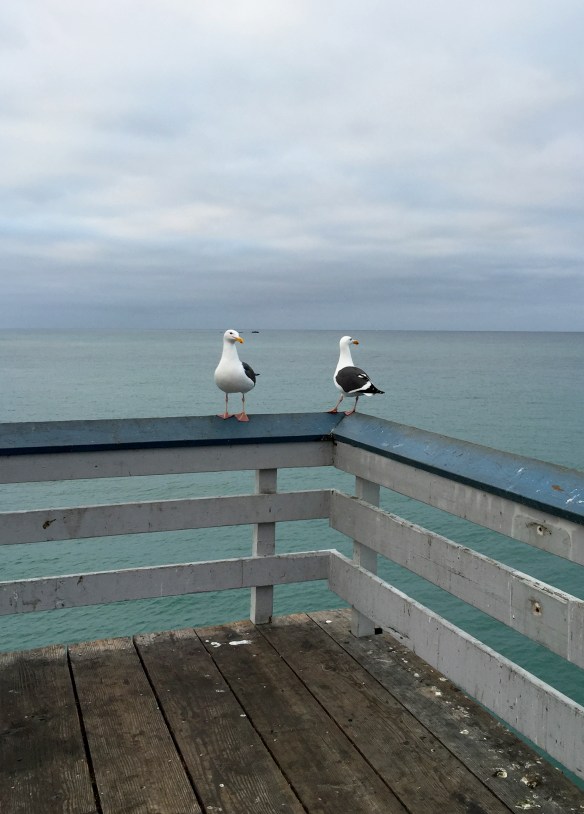
I walked to pier for the last time Wednesday morning and took photos of seagulls because I think they are cute.
They look like birds with an interesting attitude… sort of nonchalant and friendly. And these guys were posing for me so I got closer…
Close enough to notice that their tails are dotted!
Who knew! And once you notice the dots, don’t don’t you think that they pull the black and white color scheme of the feathers together? Nature is just jam-packed with little quirky details.
I have managed to ignore 3D printing so far but over the weekend my friend, Ted, sent me a link to this video about the Glowforge 3D laser printer. Deep sigh. I have lust in my heart for one of these. If only I had a spare $2000 hanging around!
I am going to hope that, as demand grows, the price will come down.
I was told that this was a must-see Des Moines site so yesterday morning Catherine and I went to see it for ourselves.
If you are in Des Moines, you are likely to see the capital’s golden dome gleaming from far away. We took the tour so I can tell you that that is real gold leaf, thinner than a hair, and that it has to be re-applied every 20-25 years.
The architectural details, both in and out, are really amazing and, now that I think about it, the whole place was really clean!
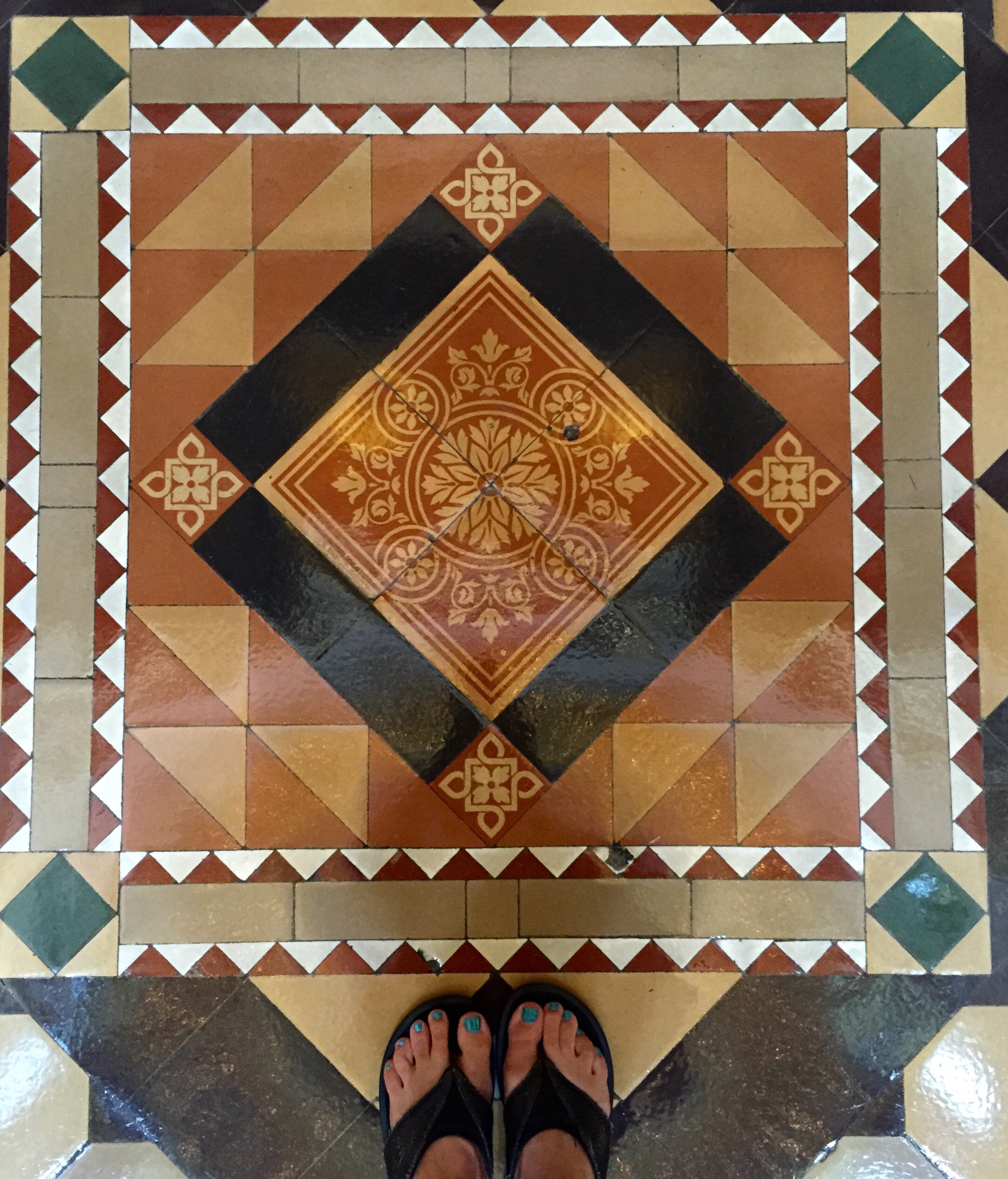
If you look down you’ll notice that the tile designs in the floors are varied and quilt-like…
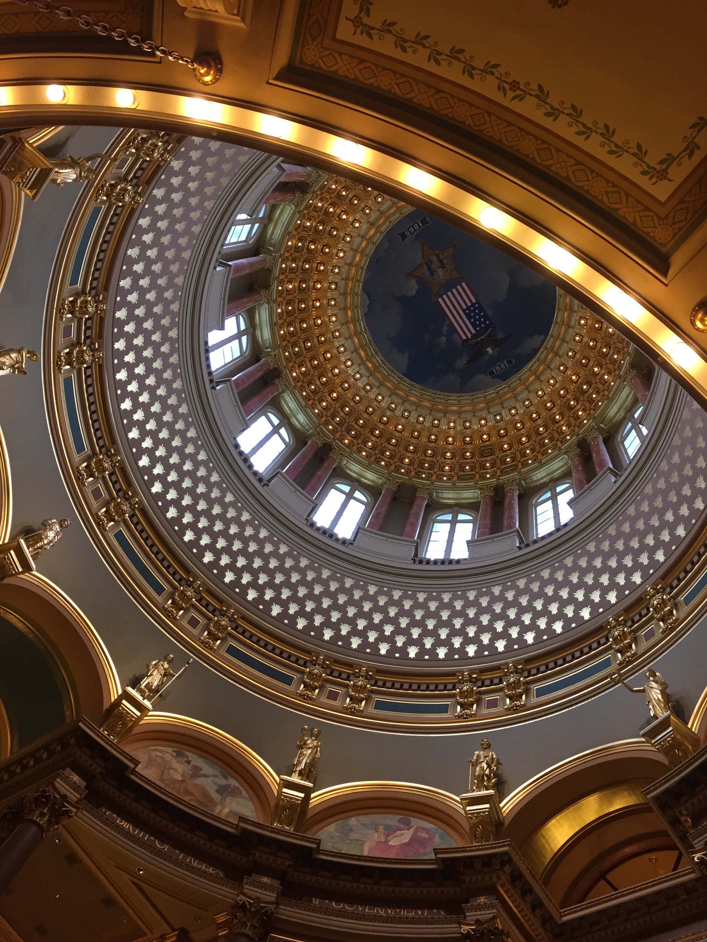
But when you look up, your jaw will drop.
If you take the (free) tour, you get to go up to the the balcony high in the dome, just below the banks of lights that illuminate the space. I was standing there when I took the following photo, looking up…
…and then looking down to the floor far below, where the ‘x’ is. That’s a person walking away, to the right of the ‘x’.
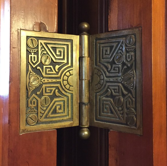
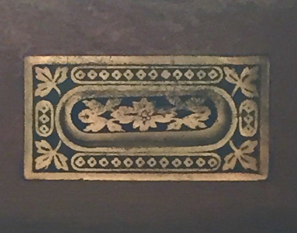
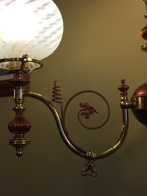
Even the smallest details were not forgotten…
door hinge
thermostat
window pull
sconce arm
There’s more to share tomorrow but for now let me say that this really is a nice place to visit. Way to go, Iowa!
I just sent a newsletter with two news items. If you aren’t on my newsletter list, here’s what you missed:
First, Linda’s current quilt auction ends tomorrow, Friday, May 22, at 12:00 noon, Pacific Time. Click here to go to the auction page.
The other item in the newsletter is a video. When I was at Quilt Market, I spent a lot of time talking to quilt shop owners about my new book, The Quilter’s Practical Guide To Color. I used sets of fat quarters to illustrate one of the more important points in the book. It occurred to me that I should share this information with everyone, so here it is:
If the video isn’t showing up for you, click here.
I am hearing from people who have read the book, telling me that it really is helping them with color. In fact, here’s an excerpt from an email that came to me from Barbara B.:
Becky, I am so glad I was able to get your Color book at Market. I read it cover to cover yesterday on my travels home from Minneapolis. It is full of great info, explained in a way that will make sense to quilters. I am excited to use it in upcoming classes.
The book is not the least bit intimidating and the concepts are easy to grasp. The fact that the info is provided in bits, using the practical advice boxes and short paragraphs, is good…
I know that books are expensive and many of you have color books that you rarely open. This one really is different, even if I do say so myself. It is not a book on color theory, it is a book with practical advice on color. Plus, there are 10 quilt patterns included. Eight quilts are pieced, and 2 of these have some applique. There are two quilts that are primarily applique. None of the patterns are difficult and each one teaches something about color and design.
If you are interested and want to order The Quilter’s Practical Guide To Color,click here.
If you are a font-lover, this will make you smile. The American Type Founders Company 1923 Specimen Book and Catalogue is a very hard-to-find book with 1148 pages of typefaces, typeface accessories, printing equipment, and insights into printing as it was in 1923. My favorite font (Caslon) is in this book, along with many others.
David Armstrong at Sevanti Letterpress has digitized the 1923 American Type Founders Company Specimen Book and Catalogue. It is in the public domain. Click here to find the digitized book. Click here to read more about the digitizing process.
Linda and I, as Piece O’ Cake Designs, were self-published for 8 years and I was in charge of all things related to layout. It was at that time that I really started to pay attention to different fonts and how they worked. These days I use fonts on the website and blog, and in downloadable patterns. When I want to put text into a quilt, I enjoy having access to the huge variety of fonts that are available today.
Even if fonts are not your thing, this book is laid out well and is full of surprises. You never know where that next cool idea is going to come from—it could be here. Enjoy!
PS – I learned about this from Chuck Green’s newsletter, which is always interesting.
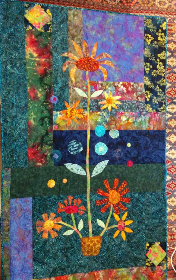
I had one of your books for years and finally just finished a quilt based off of one of the quilts. I hand quilted it. So I thought I would send a picture of how it turned out. I love your color choices in the original but wound up in a different direction.
I am always happy to see how other quilters use our patterns. Ilsabe, you did a great jpb!
FYI: In case you are wondering, this pattern is from our book, Applique Outside the Lines. The quilt in question is Peppermint Sparkle.