I am a quilt designer/teacher/author, a wife/mother/grandmother, and certified yoga instructor who is searching for balance, strength, and happiness in all things.
I shared the Flutterbye Butterflies pattern with Margery Tadder, an internet friend, a while ago. I asked her to keep it a secret until the book was closer to release. The book, 100 Whimsical Applique Designs, is available now for presale so it is time to share Margery’s Butterflies :-). I love it so much!
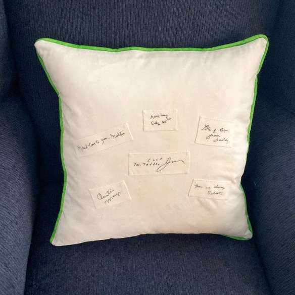
At long last, I’m sending a picture of my butterflies using your lovely Flutterbye pattern. I’ll be 93 December 1st and compared to some of my contemporaries, am doing wondrously well. After surviving a long bout of pneumonia and slowly regaining energy, am back out and about and grateful for it! I used the butterflies for a pillow. Am really happy how they turned out after a couple false starts.
Over the years I have saved family signatures thinking to use them in a quilt. It never happened but on the pillow back will trace the names of those who have passed away. It will be the perfect place.
This is my finished(yay!) Flutterbye pillow and also one of the back although it didn’t turn out as I had hoped. My plan was to scatter a number of signatures in a freeform way, but about went out of my tree trying to trace them so they didn’t look like a jumbled mess! After wasting a couple pieces of fabric, got serious and did a few the easiest way possible!
Love the butterflies and tulips and they are such pretty and cheery spot on this cold and snowy day! But what’s not to love about this darling pattern?! The pillow does need to be stuffed again as this form is too loose. You probably know the story…the Navajo women purposely make a mistake in their weavings so the gods won’t be angry because only the gods are allowed to be perfect. I tell you, if there are any Navajo gods looking down on my pillow they definitely aren’t mad! haha.
Thank you many times again, Becky, for your generosity and kindness, and Best Wishes to you and your family for a very Happy Thanksgiving!
Margery, thank you for sharing your pillow and the story to go with it. I think the signatures on the pillow back are perfect as they are and I’m not entirely sure that it needs more stuffing—but that is your call :-). I hope you keep right on stitching because it does bring joy, both in the doing and the finishing!
Kathi Dineen sent me the story that goes with these 7 wonderful quilts…
I have a Hand Appliquetion class every month. Last December I asked the ladies to bring a Christmas project—quilt table runner—pillow etc. I brought my Slice of Christmas quilt and all fell into “let’s do, it”
Here you go 7 quilts finished this year!! Thank you for all you do-love your work!!
Kathi at The Quilt Works, Albuquerque
Linda and Kathi
I love every one of these quilts! And how fun is it to see how different they are from each other :-).
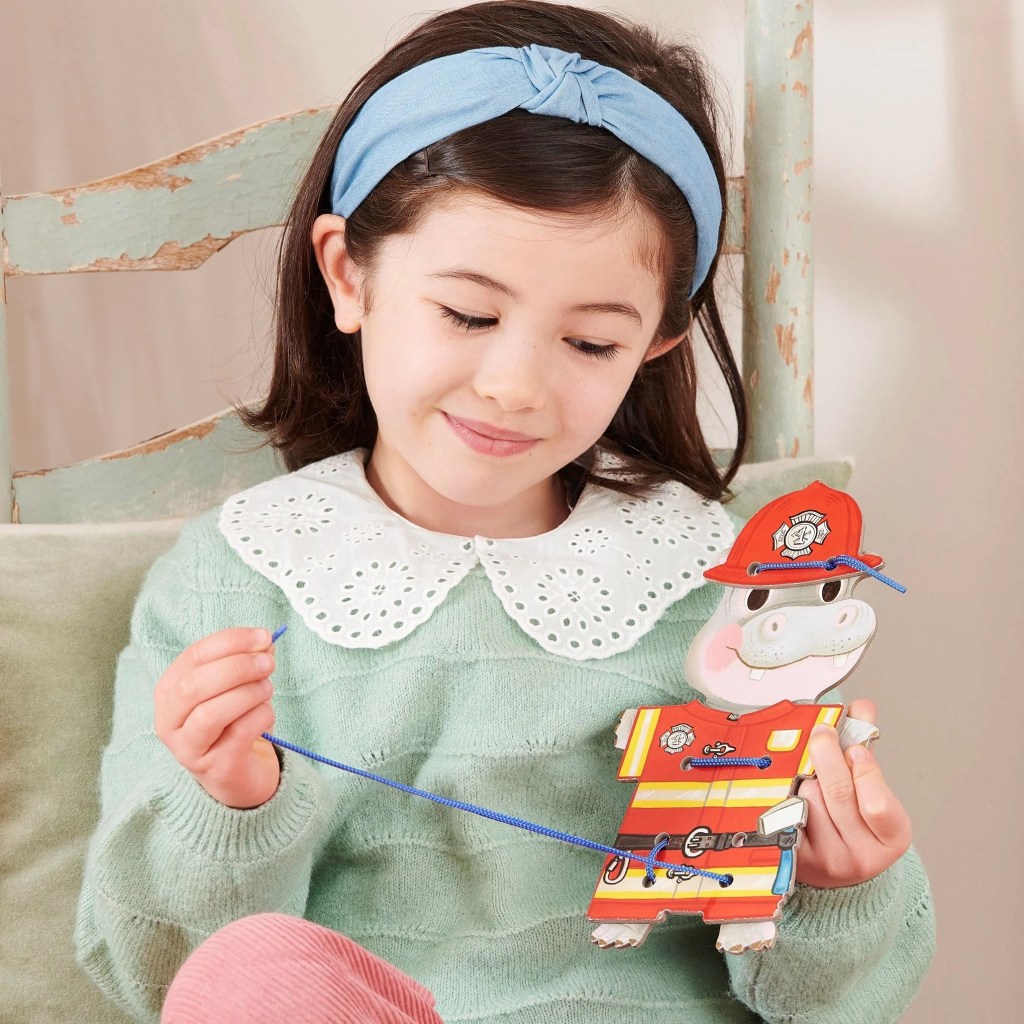
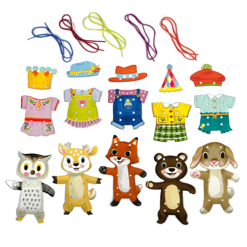
Beginning with toys for the littles, these are the coolest lacing cards ever.
They are new from eeBoo this year, big and sturdy and beautiful. They also double as paper dolls! You sew the clothes onto your little animals, and then play with them. I mean, so much fun!
Choose from ‘Occupations’ or ‘Woodland Friends’ Lacing Cards. In each set, 5 sweet and fanciful, large die-cut animals come with easy to lace-on outfits. This won the Oppenheim Gold Best Toy Award, because of course it did :-).
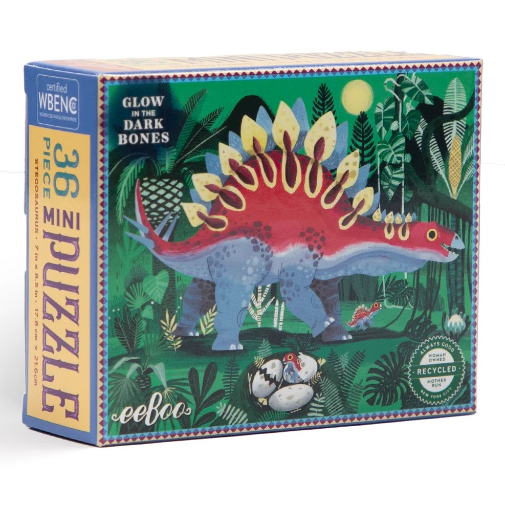
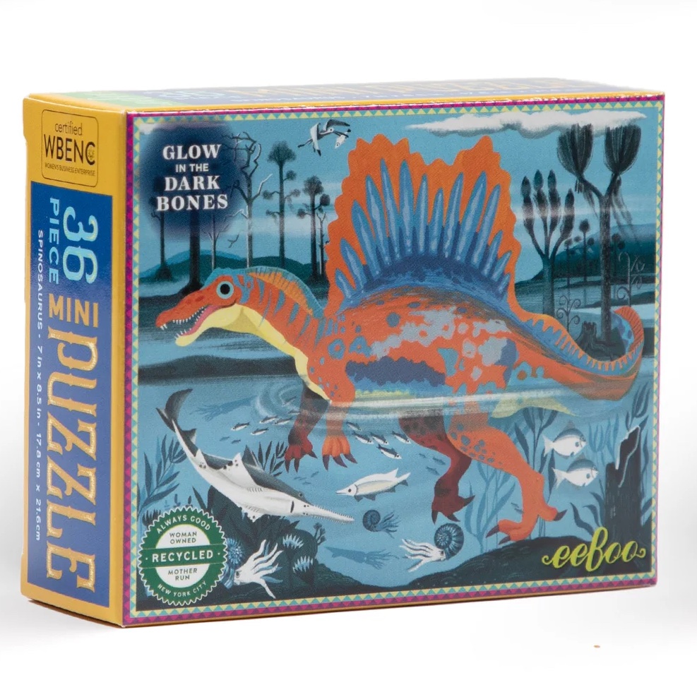
NEW Mini Puzzles have been taken to the next level! 4 different 36 piece small dinosaur puzzles that also GLOW IN THE DARK. These are not your average mini puzzles, they are the same quality as the large puzzles for adults. Printed on the front and the back to make them extra sturdy, along with the already superior cardboard. These puzzles feel good to touch, and for some of our kids, that’s a pretty big deal.
Scroll below to see all 4.
These puzzles will slip into stockings. Or I think they’d be a perfect before Christmas present, or after! During downtime at the grandparent’s house, you can have an ace up your sleeve. Pull out an unexpected gift to occupy little hands and minds. You can see the pieces are bigger than a typical mini puzzle, so the finished puzzle is bigger, too.
Puzzles are a wonderful activity that require careful observation, spatial reasoning, and patience. Piecing together a puzzle develops familiarity with pattern, shape, and color recognition.
Each die-cut domino piece features two colorful dinosaurs highlighted with shiny holographic foil, their name, pronunciation of their name, and the footprint they would have made.
Learn about 7 different dinosaurs, and develop matching and concentration skills, as you play.
NEW and amazing, eeBoo consulted doctors and experts to create anatomically accurate artwork for these Human Anatomy Puzzles, below.
Beautiful and educational, this set of 4 puzzles has it all. Bear needs these, and I could learn something new, too. Couldn’t we all? By interacting with material while playing and “puzzling” we will retain more. I hope you have a child in your life to enjoy these with.
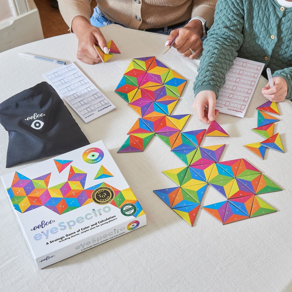
eyeSpectro is a game for slightly older children like Bear, or math savvy littles. Engaging both the right and left side of the brain, this game increases strategic thinking and numeracy skills, and introduces the color spectrum.
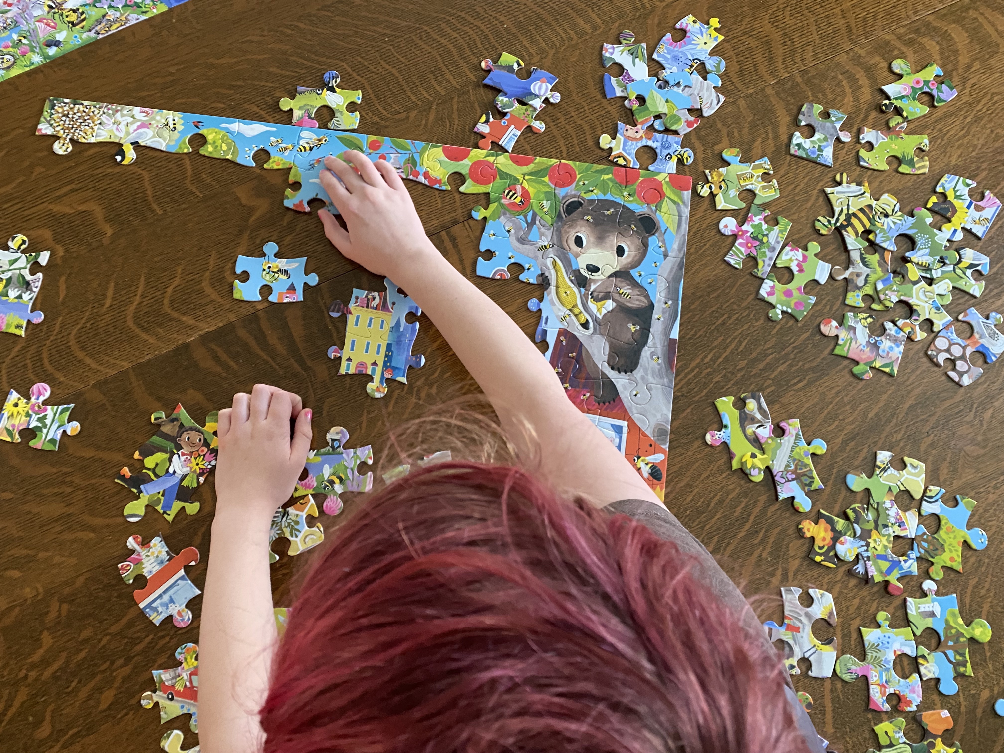
Back to puzzles, eeBoo is committed to connecting with nature through art and play. The “Love of…” series is specifically intended to give children a space to interact with nature they might be nervous about. Love of Bees and Love of Bugs are both beautiful puzzles, and are perfect for adventurous kids as well as the more timid. Bear is below working on his “Bees.”
As always eeBoo artwork invites imagination and playfulness as we interact, and these puzzles are on point.
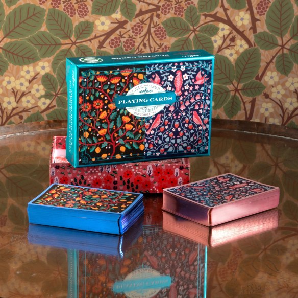
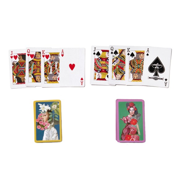
Last, and definitely not least, these beautiful decks of playing cards are new from eeBoo this year. Playing cards with our kids is a tradition in our family that has carried through the generations. We laugh, get intense, learn new things, and laugh some more. Chris and Lorna and kids love spades these days. What card games does your family play?
Birds & Flowers
Birds & Flowers
Garden of Eden
Garden of Eden
From the Garden
From the Garden
Scroll above to see the 3 we have in stock: Birds and Flowers, Garden of Eden, and From the Garden. Gorgeous artwork combines with extremely high quality, and you will be enjoying these cards for years and years to come.
We know eeBoo uses sustainably sourced materials, and is consistently committed to protecting our planet. They have a carbon footprint of zero. What I didn’t know is that they also make sure they use suppliers that are benefitting the communities they are located in, instead of using up resources and causing harm. It is difficult to find gifts you can feel good about in every way, and eeBoo creates exactly that. Inexpensive, high quality, useful, good for planet and people. And women owned! Click to see all our eeBoo Puzzles and Games.
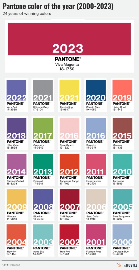
I don’t need to write anything. Instead I will share this chart and this link to a really great article about the woman, Leatrice Eiseman, who has chosen the color of the year for Pantone since the beginning.
It’s fun to look back at all the colors…
Playing with color for your job sounds lovely. However, naming colors sounds like real work to me. Congrats to her for doing both jobs well!
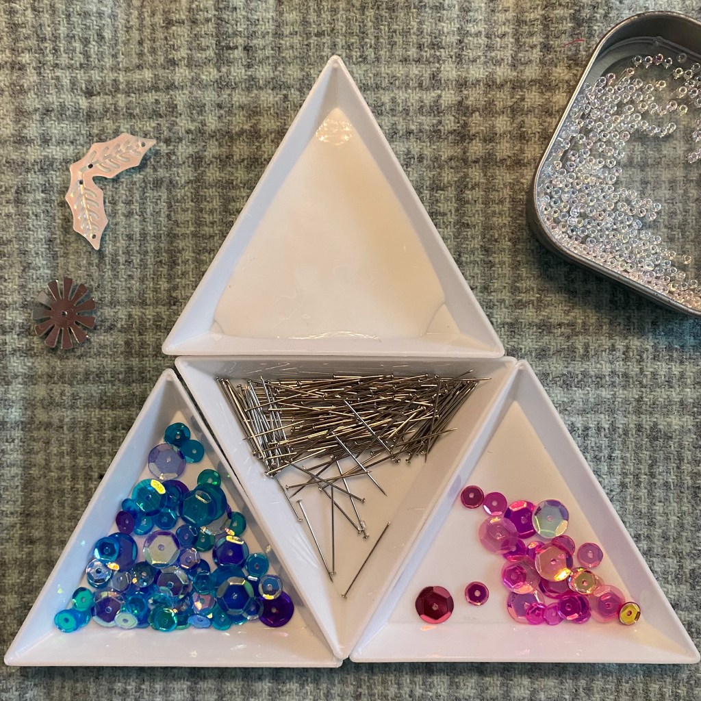
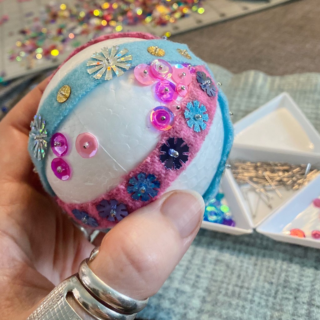
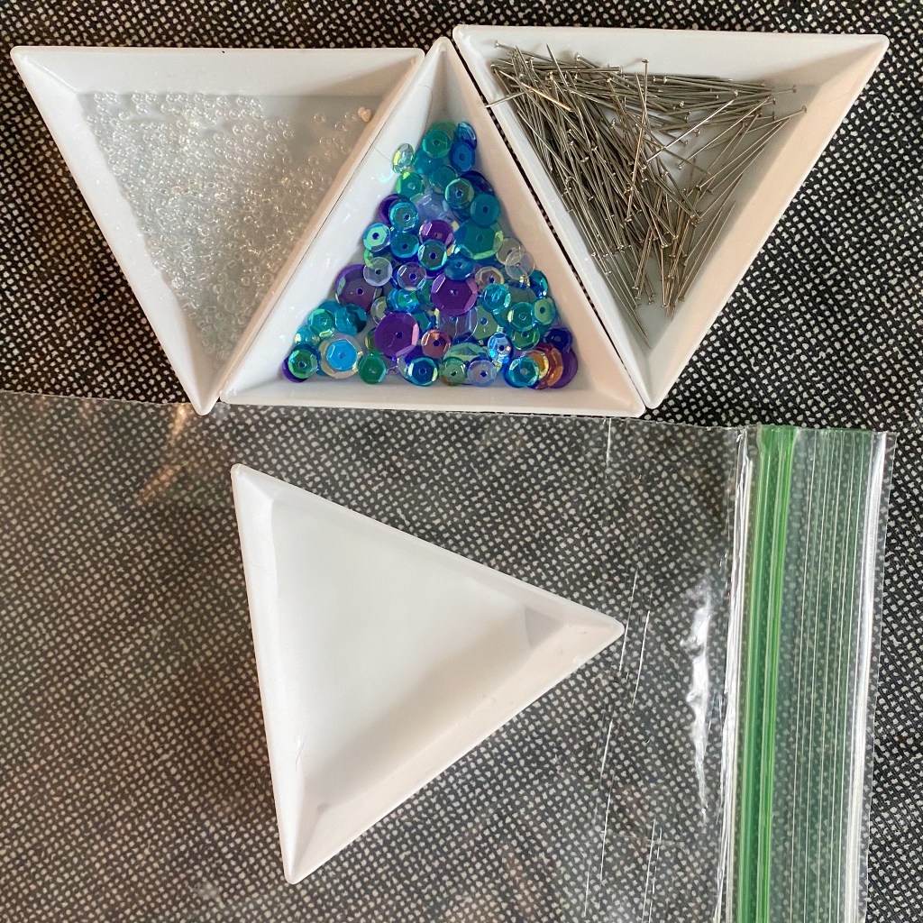
Lorna has been making sequin ball ornaments using the Sequin Ball Kit at pieceocake.com and she wanted to share the story. Here’s Lorna…
I had an idea to use wool like Becky did (video at bottom), but vertically, and it was honestly easier than I thought it would be. I cut 1/2″ wool strips about 4-1/2″ long (you can always trim, so don’t stress) with a rotary cutter and I set up my work space.
Somewhere in the middle of making the ball, I realized that I forgot to poke a hole through the center of the ball for the wire. I’m going to add that later, after I find a skewer to poke through.
I started with the blue strips. The foam balls have a little mark on the top and the bottom, and a faint line around the middle, again making this easy. I loaded my pin with the bead and sequin, used the tip of the pin to put a little glue at the top (or bottom) of the ball, added the wool on the glue, dipped the tip of the pin in the glue again and then stuck it through the wool into the ball to secure it. Then I did the same at the bottom (or top), and here is where you can trim if your wool strip is too long.
Then it was just the regular process of loading the pin with the bead and the sequin and the glue, but through the wool into the ball. I did the same with the other two blue wool strips.
I trimmed the pink wool strips so they would kind of fit in, and did the same process with those three. At that point I had created 6 small empty sections and I sorted out pink and blue sequins into my trays. Then it was just the normal process as described in the video.
I haven’t filled in the blue wedges yet, but the pink are done. Overnight, I put my bead tray with glue into a plastic sandwich baggy to keep the glue from drying, and it worked just fine.
I liked the 1/4″ strips with the little stars, and if I had it to do again, I’d play more with the wool. In fact, I’m already thinking about what my next ball will be like. It might be a rainbow! We talk about wool applique being fast, but wool makes this super fast, too. The more wool you use, the faster it goes. And it’s pretty!
If you don’t already have wool scraps, Tracy Trevethan Wool is the best, quality and color selection, IMO (in my opinion).
The random number generator chose Lynn J. from Wisconsin and she will receive the nice grouping of small items that are mostly from Moda. This week we gave away 2 small notebooks, some acrylic templates, a sewing charm bracelet and (not from Moda) a bag of wooden owl buttons!
I’ll be back with another Giveaway next Wednesday. Until then you can shop for all sorts of sewing notions, books, and other fun stuff at pieceocake.com!