Jan Hirth sent me a picture of her Fitbit in front of her quilt-in-progress, Honey Beez! I can’t wait to see the finished quilt. Love the gray behind those splashy Kaffes.
And, I must add that I’ll wear my sister’s watch on my arm, with the Fitbit, just like Jan is here. Not all the time, but often. Nice to know that that’s a thing people do :-).
I just sent a newsletter with two news items. If you aren’t on my newsletter list, here’s what you missed:
First, Linda’s current quilt auction ends tomorrow, Friday, May 22, at 12:00 noon, Pacific Time. Click here to go to the auction page.
The other item in the newsletter is a video. When I was at Quilt Market, I spent a lot of time talking to quilt shop owners about my new book, The Quilter’s Practical Guide To Color. I used sets of fat quarters to illustrate one of the more important points in the book. It occurred to me that I should share this information with everyone, so here it is:
If the video isn’t showing up for you, click here.
I am hearing from people who have read the book, telling me that it really is helping them with color. In fact, here’s an excerpt from an email that came to me from Barbara B.:
Becky, I am so glad I was able to get your Color book at Market. I read it cover to cover yesterday on my travels home from Minneapolis. It is full of great info, explained in a way that will make sense to quilters. I am excited to use it in upcoming classes.
The book is not the least bit intimidating and the concepts are easy to grasp. The fact that the info is provided in bits, using the practical advice boxes and short paragraphs, is good…
I know that books are expensive and many of you have color books that you rarely open. This one really is different, even if I do say so myself. It is not a book on color theory, it is a book with practical advice on color. Plus, there are 10 quilt patterns included. Eight quilts are pieced, and 2 of these have some applique. There are two quilts that are primarily applique. None of the patterns are difficult and each one teaches something about color and design.
If you are interested and want to order The Quilter’s Practical Guide To Color,click here.
I made a video about the Color book a little while back and then promptly forgot to post it. I need another me to keep up with social media :-). At any rate, here it is! Let me know what you think.
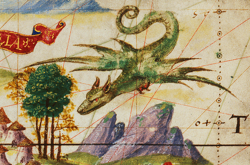
I subscribe to Chuck Green’s Design Briefing newsletter. The newsletter itself is full of links to interesting design site. In newsletter #186, the first was the link I clicked on took me to the Gallica, the digital library of the Bibliotheque Nationale de France.
The site is (of course!), in French which makes navigating it a bit more of a mystery, but it was fun to click around.
There are all sorts of images, maps, and much more. I clicked through many of the Fantastic Creatures from maps…
I have no idea where I might use any of these images, but it is fun to browse because you never know exactly where inspiration might come from. That said, when you visit a site like this, it’s always good to find out how you can use the images. The site says that the non-commercial use of the contents is free of charge, subject to compliance with the current legislation and the inclusion of the source’s statement. The commercial use of the contents is subject to payment and covered by a license.
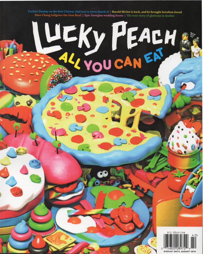
Chuck Green also linked to Robert Newman, who reviews contemporary magazine covers at Folio blog. He has an impressive design bio. The newsletter link took me here, where Mr. Newman was reviewing the cover of Lucky Peach magazine. It is worth reading because what it true for foodie magazine covers it also true for quilts if you want your quilt to stand out from the crowd.
As I was writing this post, I went back to Lucky Peach only to find the newest cover and darned if the cover, all by itself, didn’t make me subscribe! I hope I like it :-). If nothing else, I’ll enjoy the covers!
Blue and orange are complementary colors—opposite each other on a color wheel with 12 wedges. Complementary colors combine well (to put it mildly). Lately I’ve been noticing some especially nice orange clouds floating against blue sky, both at sunrise and sunset.
Colorful skies are not news to many of you—but I don’t live where I see the horizon often. There’s always something in the way… but every now and then we get a spectacularly showy sky!
If you haven’t looked at the fabric page at pieceocake.com lately, you have missed seeing the big prints that I’ve recently added, along with some interesting smaller-scale prints…
There are BIG numbers in 4 different colorways, flowers, dots, and more…
While I put these together into fat quarter bundles, you can buy them separately. If that’s the case, go to the fabric page and click on the swatch that interests you.
This is probably the oddest of the fabrics I’ve added. It’s called Junebug, by Alexander Henry. I suspect I will use it on a quilt back, but it could also show up on t a quilt front. In fact, it would be fun to use in the free Really Simply 9-Patch pattern (click here, scroll down, click the link).
I put Junebug with a black print and with the saffron Numbers… I have no idea why I like these together, but I do.
I only got one bolt of each of these new fabrics and won’t re-order. If any of them make you happy, order while I have plenty. I’ll send a newsletter in a week or so and there’s no telling how much of any print will be left :-).