Perspective…

While walking, I came upon this scene…

StripedStands-1

The way those striped things* are placed, each one farther away than the one before, so that your eye is drawn along them—into the distance. I liked the placement, and their orange stripey-ness, and the orange cones in the street. I took more than one picture.

In the next photo, because of where I am standing, those things* are lined up more precisely. You can put yourself where I am, looking down them.

StripedStands-2

This vantage point keeps the viewer on the left side of the image. It’s subtle, and it’s interesting. Scroll up to the first photo and you’ll see what I mean.

Why is this so? It’s because the line of those striped things* curves just a bit to the right in the first photo, which leads your eye toward the center of the frame. In the second photo, they are in a straighter line and the endpoint stays on the left side of the frame.

Most quilts, mine as well as those make by others, are designed in such a way as to keep the viewer centered. This makes me want to design a quilt (or quilts) that puts the viewer in a different place.

*What are those things called?!


Piles and piles of fabric…

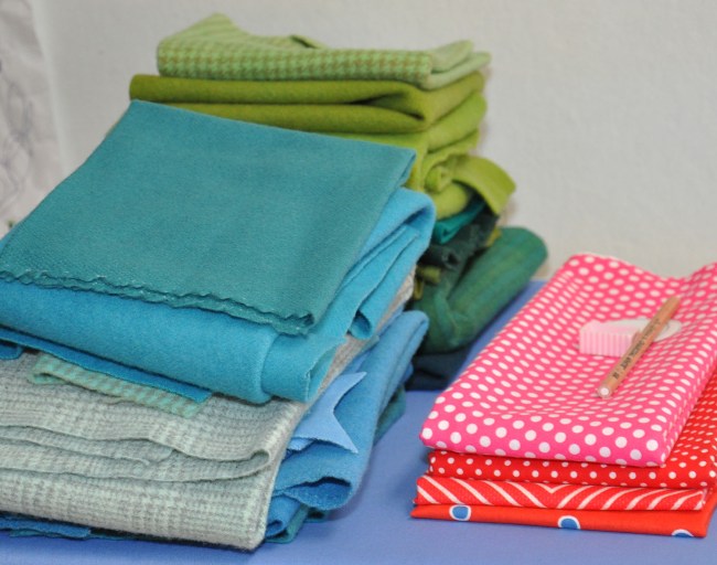
Linda is on her way home after having been here since last Tuesday. We worked on two up-coming books. One book is about appliqueing with wool in combination with cotton and linen fabrics. I can’t show you any projects but I can show you a pile of fabric that I will use to make a table runner. Just looking at the colors makes me happy!

Image

We also went to McKinney to shop for fabric (twice) at both The Quilt Asylum and Happiness is Quilting. We are also working on a revision of our Piecing book and we needed new fabric for those quilts. I won the spending contest, but not by a whole lot :-). My fabric is now washed and folded (Linda helped me with that). Paul will wash her fabric when she gets home.

Most of the fabrics in my piles, below, are from our shopping trips, and some is from my stash. I’m sure that these fabrics will be joined by others as I make the quilts on my list.

PiecingFabricPiles-01

The fabric I bought seemed so much bigger when it was in the shopping bags than it does when it has been neatly folded and stacked. I suppose that’s a good thing—otherwise I would need another closet for my stash.


Colorful California…

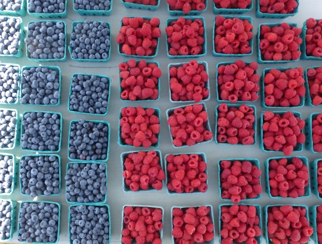
Digital photography is so very wonderful. Remember film? And the wait for pictures, most of which were awful? Digital photography makes it possible for each of to take amazing photos. That said, these are not ‘amazing’ but they are pretty.

Image

I love the aqua boxes. They are like sashing between the colorful fruit. The man behind the stand was looking at me funny as I took pictures of his tables.

Image

The field of yellow flowers (next) was eye-popping set into the drabber grasses…

Image

Farther down the road there was a bigger field of yellow with people scattered around in it, taking photos. Lots of kids sitting, surrounded by yellow. I’ll bet the pictures are terrific. We do the same thing in Texas when the bluebonnets are blooming.

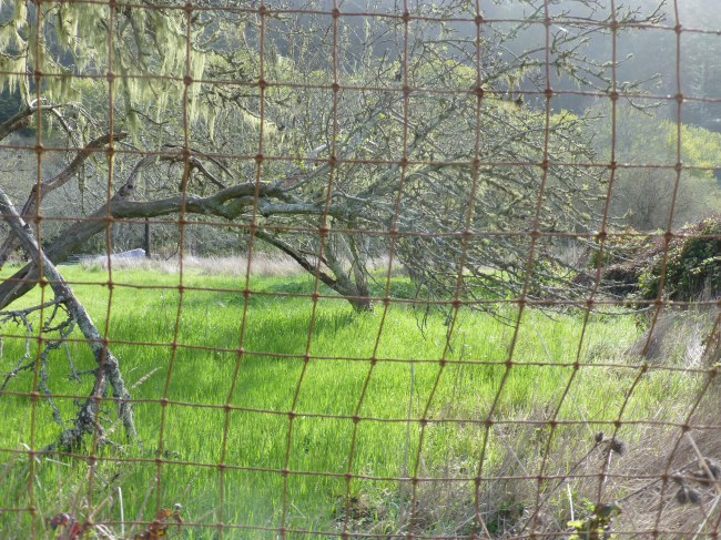
The next photo is not so much about color as it is the pulled grid of the fence that lays over the scenery behind.

Image

It suggests an interesting quilting pattern that could be sewn over a variety of quilt tops. Done well, it would be both interesting and sort of invisible… like a wire fence.

I love a (working) vacation…

Steve and I are in Santa Cruz, which is a vacations stop on the way to King City where I will teach and lecture on Monday. Today we hiked at Big Basin Redwoods State Park. This is a huge park and we only saw some of it. For me, the most exciting part of the hike  involved a dangerous water crossing :-). Steve carried the camera and my phone in case I slipped off the log. He also found a long stick which helped me to stay balanced. (I left the stick by the water and I hope others have made use of it.)

Image

There were lots of other hikers on the trail, and bicyclists were out in force. And motorcyclists. Actually, everyone in the Santa Cruz area was outside today.

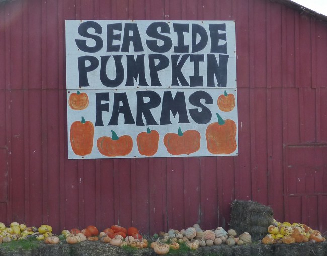
One thing I noticed on the drive were the fun, hand-painted signs. If you’ve driven Highway 1, you’ve probably seen this:

Image

Yes, the truck is eye-catching, but it’s that big strawberry that is the best! And the other signs around it are each wonderful in their own way. If we are jam, we would definitely have stopped for a taste.

Looking at the signs made me think about how self-conscious I sometimes am about my own handwriting. And, if I were to ever paint a roadside sign, I’m pretty sure that I would try to make it too perfect.

Image

These signs are more eye-catching because they are so obviously made by hand.

Image

The imbalance, the quirkiness, the imperfections, all show the hand of the maker in the design. This is exactly why I find myself drawn to improvisational quilt designs, both pieced and appliqued.

Magenta!

I subscribe to Now I Know, written by Dan Lewis. I get an interesting email about 5 days a week and on Feb. 4 I learned more about magenta.

Imgres.1

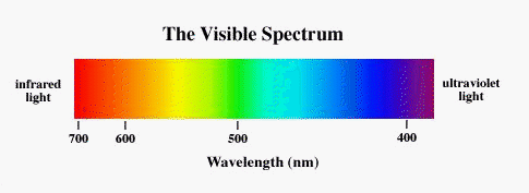
We all know that magenta fits in between red and blue, so why don't we see it in a rainbow? Now I know! 

The short story is that when visible light is broken down into colors (red, orange, yellow, green, blue, Indigo, and violet), red is at one end and violet is at the other. They don't connect so the blended color between them (magenta) isn't there. Click here to read the longer story.

Visible_spectrum

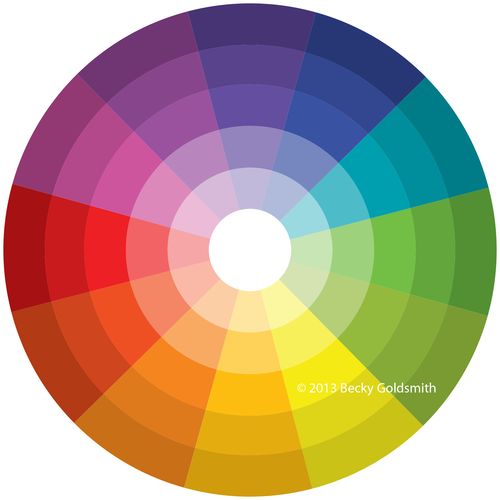
It's also interesting to note that magenta isn't on a standard, 12-wedge color wheel. Violet is what you will find next to red there too.  

BeckysColorWheel

In related news, I only thought I was done with the manuscript for the Color book. My editor called Friday with several suggestions. After a deep sigh, I realized that her points were excellent and that the re-writing will make the book even better. So that's what I've been working on instead of blog posting. 

One of Lynn's suggestions was that I look again at Joen Wolfrom's Ultimate 3-In1 Color Tool. You know what? It's really very helpful! She includes a 24-part color wheel that includes magenta and more. Cool. But what's really nice about this tool is that it takes each of the 24 colors and shows them in a variety of tints (lighter versions), shades (darker versions), and tones (grayer versions).

It is the addition of tones that I think is the best part of this tool. If you work with grayed fabrics (like Civil War prints) this is really handy. For example, if you have a grayed red fabric and you want to put green with it, you can look at the greens and you will find a variety of grayed greens. Take the tool with you to the quilt shop and you can look for the best match to the color you want.

I've got the 3-In-1 Tool on order and will have it on the site soon.


Come to A Small Town Quilt Show – In A Big Town Way…

Im teaching small town quilt show logos 1200px
Have you heard about this new quilt show? I'll be teaching, along with many other nationally known teachers, June 26-28. Now is the time to make plans to attend!
 
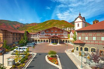
It is going to be held in a beautiful spot, the luxurious Zermatt Resort and Spa in Midway, UT. A luxurious resort combined with quilting—sounds perfect, doesn't it?
 
  Zermatt-Resort
 
Click here to see a list of all the classes and to register. Below, you will also find links for the Small Town Quilt Show teachers. I hope to see your smiling face there :-). 
 
Tina Lewis