These eyeglass cases are quick and easy, and they make a great gift! In addition to glasses, they will also hold a rotary cutter—great for traveling quilters.
Fabric note: I used Pepper Cory‘s Brushstrokes line (not Peppered Plaids) for the background fabric in these projects. The colors I used are Tangerine, Horizon Blue, and Sprout. They have a good hand, they are neither too thick nor too thin.
I also love her Peppered Cottons. The warp and weft threads are different colors which gives the fabric depth. These, too, are a very nice weight to work with.
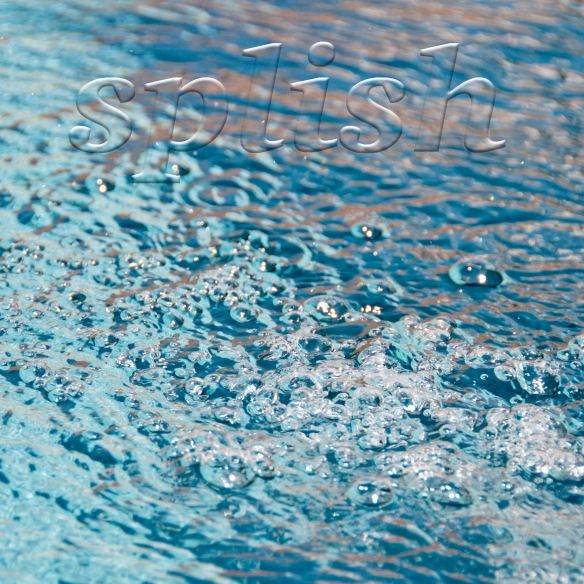
I’ve written before about the 52 Week Photo Challenge online class that I’m taking from Ricky Tims. Best class ever! This week’s assignment is how to add a text overlay to a photo.—yet another cool thing that you can do in Photoshop that I had no idea existed.
I’ve taken 3 photos (Splish is one of them) and I like them all. If you have a bit of time, please do click here and then leave a comment on this post telling me which one you like the best.
Choosing the word(s) was the hardest part of this photo challenge. The same thing is true when you add words to a quilt, as I wrote about in this post. Text is powerful. It draws the eye and, no matter how big or small it is, what you say can dominate a design. The quilt that I made after that post is called Say Something (below), which is in The Quilter’s Practical Guide To Color.
The words take up a small percentage of the space on the quilt, but they are the focal point, dominating the design. This is good to remember when you want to make what may be a simple quilt into a more complex statement.
Update: Thank you all for your comments! I’ve decided to submit the car photo because I like it as is. After reading your comments, I think I need to make the word “splish” more legible in the water photo and I don’t have time today to do that. So, the car photo it is and I can mark that off the list. Thanks!
I sometimes wake up at night, thinking and/or worrying. Do most women do that? For me it’s not an every-night occurrence—it happens in spurts.
When Steve and I were younger and made a lot less, I woke up worrying about money. Steve never did, and he thought I was crazy to lose sleep worrying about problems that would work themselves out. (It takes a lot to make him wake up worrying.) He was right; those worries tended to dissipate with time.
These days I am more likely to wake up thinking about how I’ve managed to do or say something stupid the day before, the week before, or farther back. I wish I could say that I always say and do the right thing. I try, but I fail often enough to wake me up—thankfully, not every night.
What gets me back to sleep is the thought that where there is life, there is hope. Every day really is a new day, with a chance to do better. Goodness knows, I keep trying and maybe someday I’ll be like those people who always seem to know the right thing to say or not say, at exactly the right time. If you do this too, take heart in the fact that you are not alone. We are each of us a work in progress :-).
Creative thoughts…
Then there are the times I wake up with creative ideas. I like this a whole lot better, even if I do lose sleep, which brings me back to the topic at hand… deep thoughts.
Most of us don’t create in a vacuum—our creativity is fed by that of others. So it makes sense to be open to new ideas, new ways of seeing and interpreting the world around us. With that in mind, I’d like to direct you to this post by Pam Holland. I especially enjoyed the video she posted. Pam is a beautiful photographer and her images do flutter around in my head. Thank you, Pam, for posting them!
I also very much enjoyed the TED talk by Béatrice Coron, a papercutter artist whose work I had not seen until I found this video (bottom of post). Her work is inspiring, beautiful, and thought-provoking. FYI: I found this talk by going to TED and searching for ‘creativity’. I’ll bet searching for ‘inspiration’ would yield wonderful results as well.
I am currently feeling my way toward new ideas, even as I work on quilts that are stylistically similar to those I’ve made in the past. Once these are complete, I can turn my attention to quilts that are, I hope, completely different for me. Until then, ideas are constantly swirling around in my head, and I’m enjoying the thinking process.
In closing, let’s all sleep well, turn off the worries, trust in a new day, and think about being creative!
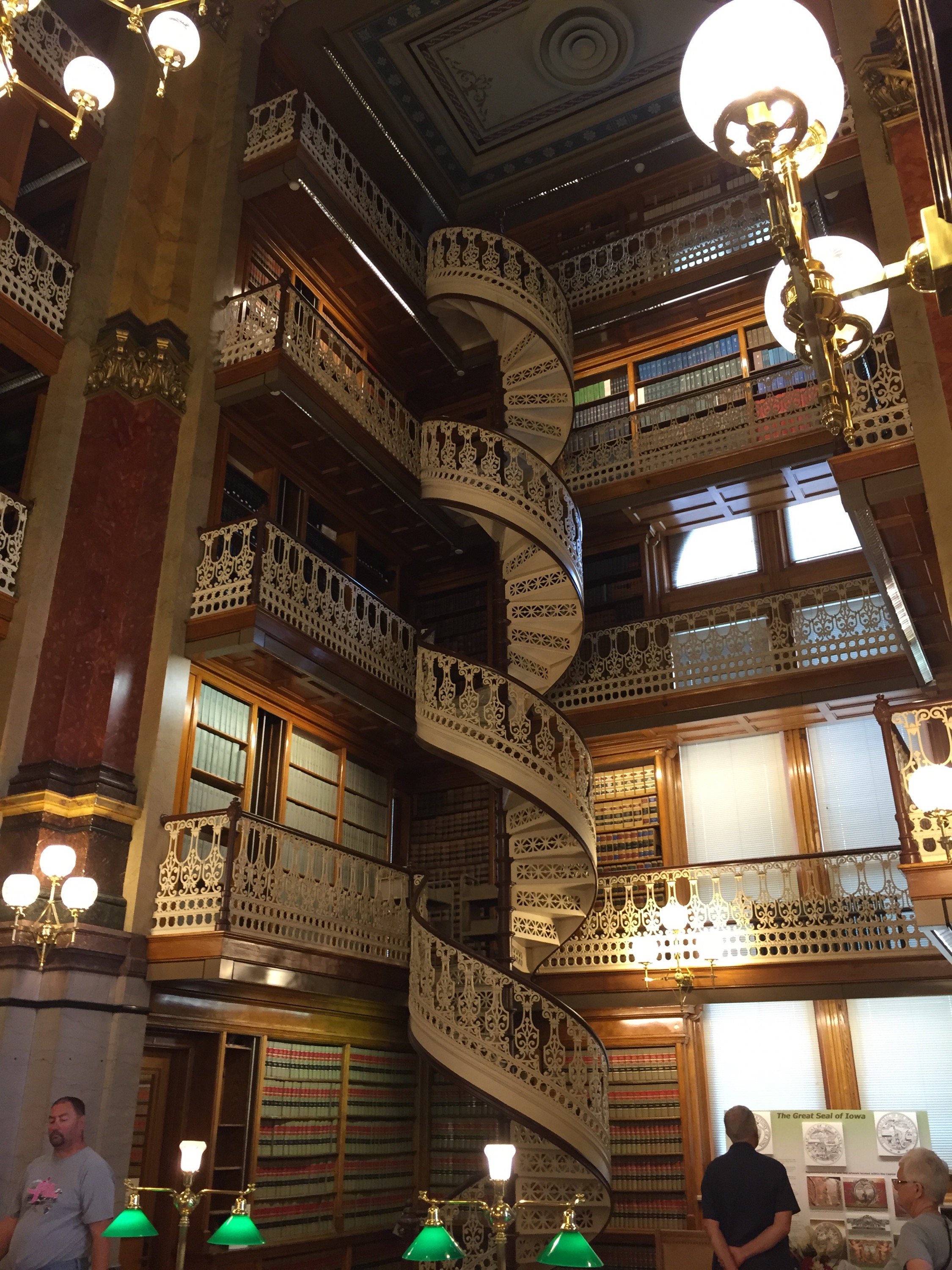
I was told that this was a must-see Des Moines site so yesterday morning Catherine and I went to see it for ourselves.
If you are in Des Moines, you are likely to see the capital’s golden dome gleaming from far away. We took the tour so I can tell you that that is real gold leaf, thinner than a hair, and that it has to be re-applied every 20-25 years.
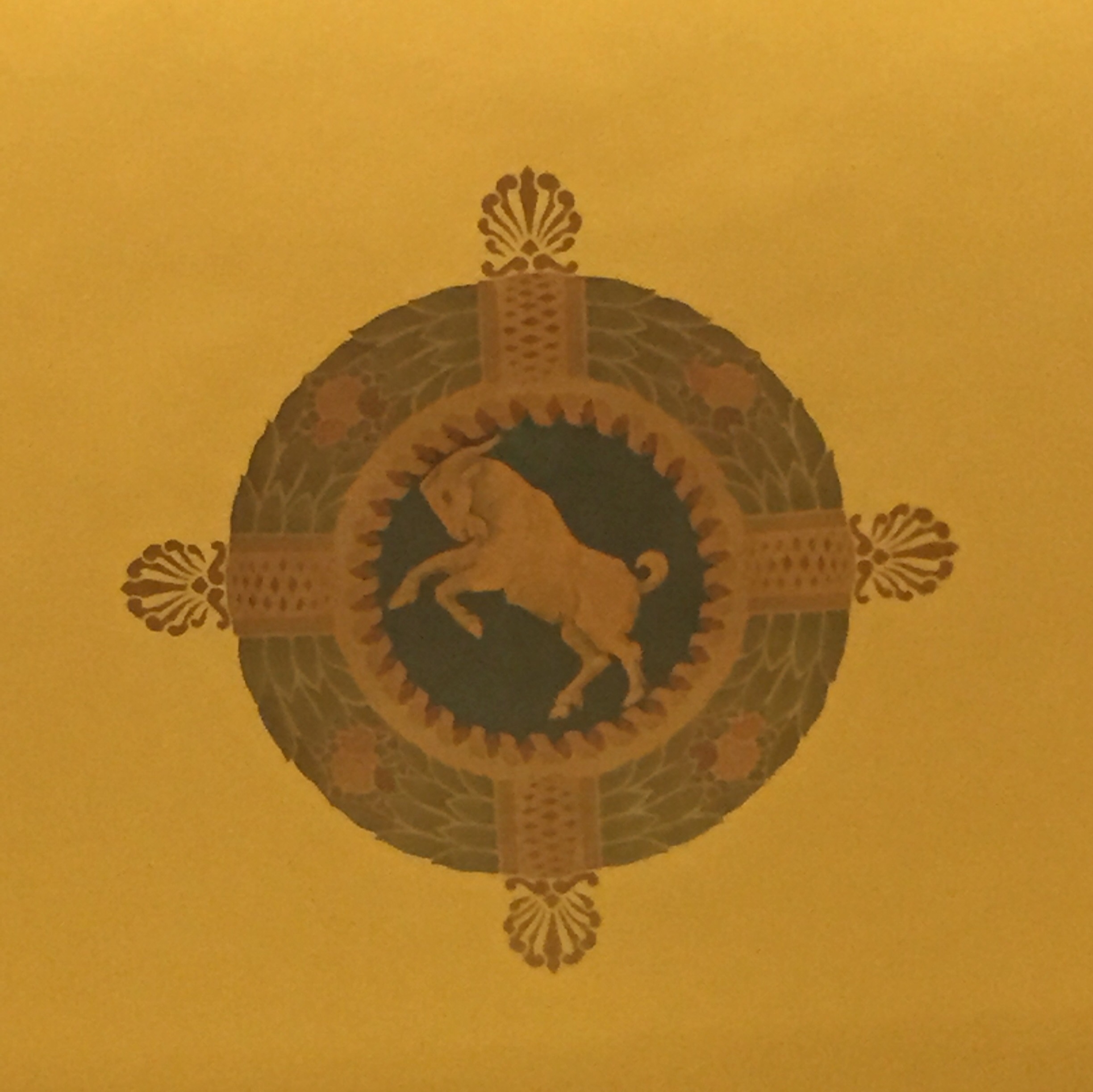
The architectural details, both in and out, are really amazing and, now that I think about it, the whole place was really clean!
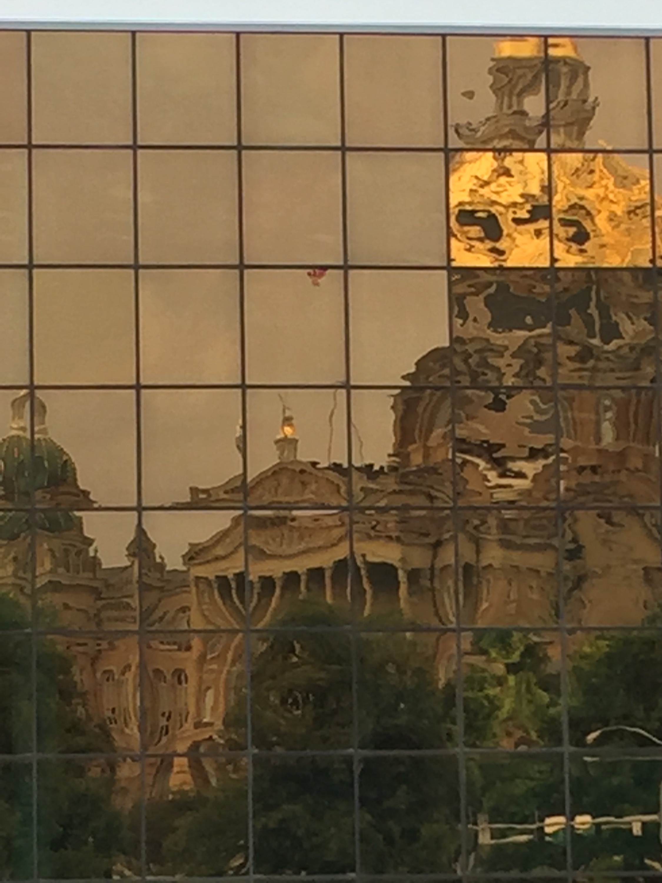
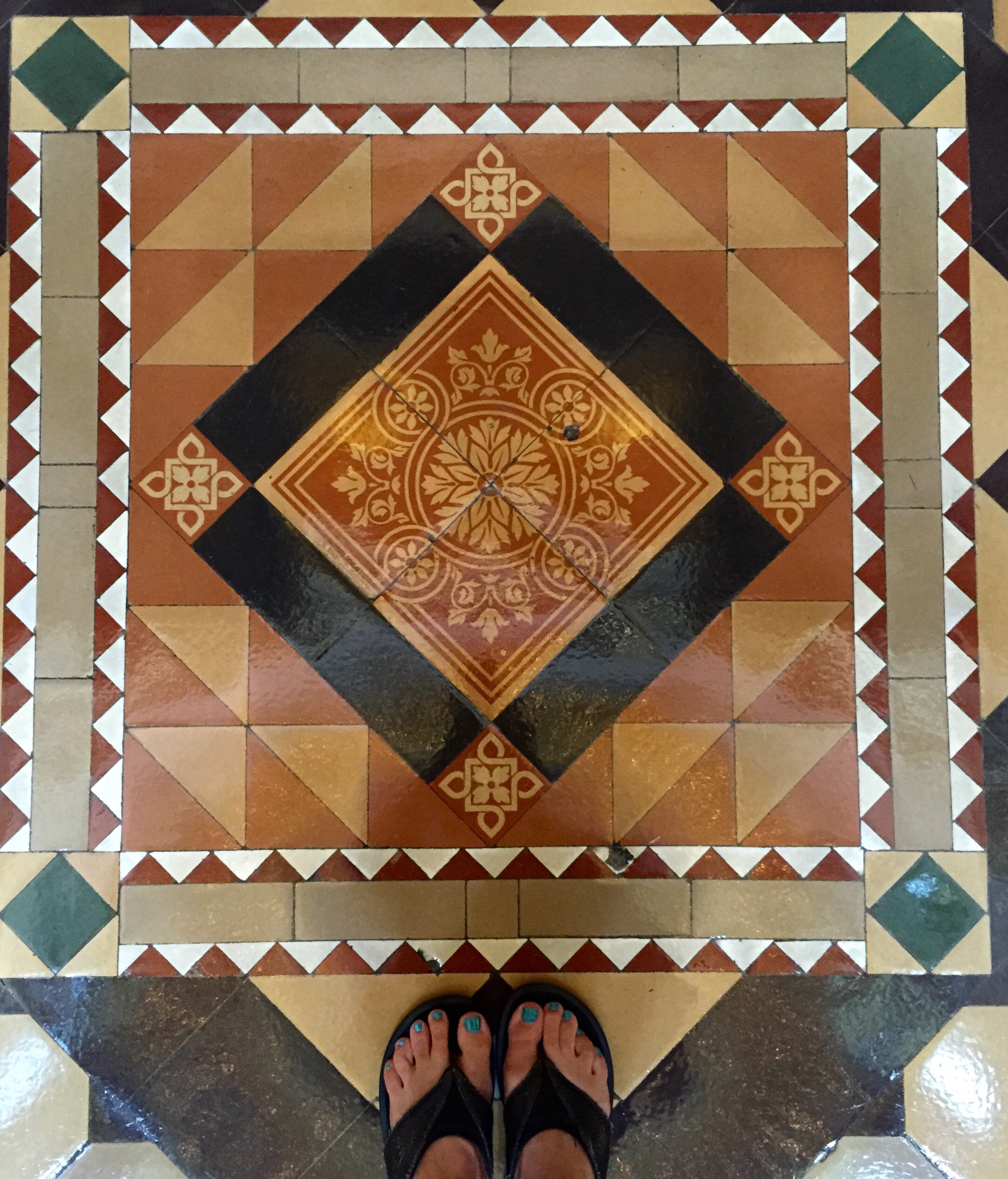
If you look down you’ll notice that the tile designs in the floors are varied and quilt-like…
But when you look up, your jaw will drop.
If you take the (free) tour, you get to go up to the the balcony high in the dome, just below the banks of lights that illuminate the space. I was standing there when I took the following photo, looking up…
…and then looking down to the floor far below, where the ‘x’ is. That’s a person walking away, to the right of the ‘x’.
Even the smallest details were not forgotten…
door hinge
thermostat
window pull
sconce arm
There’s more to share tomorrow but for now let me say that this really is a nice place to visit. Way to go, Iowa!
I just sent a newsletter with two news items. If you aren’t on my newsletter list, here’s what you missed:
First, Linda’s current quilt auction ends tomorrow, Friday, May 22, at 12:00 noon, Pacific Time. Click here to go to the auction page.
The other item in the newsletter is a video. When I was at Quilt Market, I spent a lot of time talking to quilt shop owners about my new book, The Quilter’s Practical Guide To Color. I used sets of fat quarters to illustrate one of the more important points in the book. It occurred to me that I should share this information with everyone, so here it is:
If the video isn’t showing up for you, click here.
I am hearing from people who have read the book, telling me that it really is helping them with color. In fact, here’s an excerpt from an email that came to me from Barbara B.:
Becky, I am so glad I was able to get your Color book at Market. I read it cover to cover yesterday on my travels home from Minneapolis. It is full of great info, explained in a way that will make sense to quilters. I am excited to use it in upcoming classes.
The book is not the least bit intimidating and the concepts are easy to grasp. The fact that the info is provided in bits, using the practical advice boxes and short paragraphs, is good…
I know that books are expensive and many of you have color books that you rarely open. This one really is different, even if I do say so myself. It is not a book on color theory, it is a book with practical advice on color. Plus, there are 10 quilt patterns included. Eight quilts are pieced, and 2 of these have some applique. There are two quilts that are primarily applique. None of the patterns are difficult and each one teaches something about color and design.
If you are interested and want to order The Quilter’s Practical Guide To Color,click here.