The wonderful wheel of color…

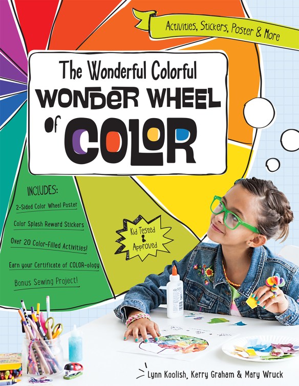
Three of my friends at C&T (Lynn Koolish, Kerry Graham, and Mary Wruck have written a book about color, and the ‘Wonderful Wheel Of Color’ for kids and I’ve gotta say that I am impressed! (FYI, you’ll find this book on my site here.)

WonderfulWheelOfColor-1000

First, the color information is written for kids but it is not dumbed down. The language is clear and written in a way that kids will relate to. Elanor is already looking forward to getting her hands on this book :-).

ColorBook-3

There are plenty of activities. Some are what you would expect in a book about a color wheel with color wheel patterns to paint, collages to make, and designs to color. But there is even more! There are projects perfect for kids, and maybe adults!

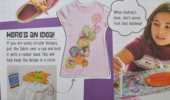
Elanor’s BFF, Lola, is coming to visit for 2 weeks this summer. They’ll be spending quite a bit of time at our house and I can see t-shirts…

ColorBook-2

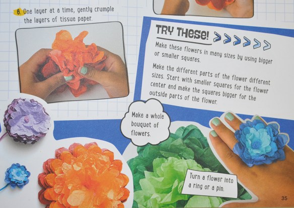
…and paper flowers…

ColorBook-4

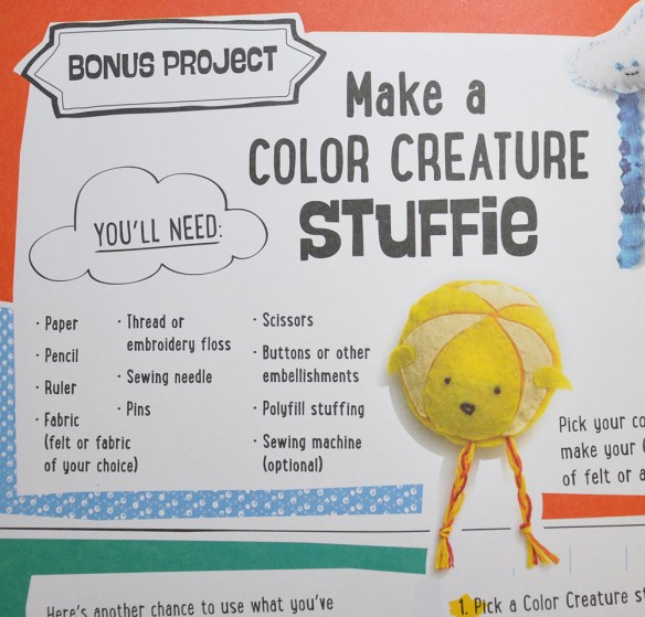
…and hand-sewn stuffies in our future!

ColorBook-5

This book is only $12.95! You can find it at pieceocake.com here.

Perspective…

While walking, I came upon this scene…

StripedStands-1

The way those striped things* are placed, each one farther away than the one before, so that your eye is drawn along them—into the distance. I liked the placement, and their orange stripey-ness, and the orange cones in the street. I took more than one picture.

In the next photo, because of where I am standing, those things* are lined up more precisely. You can put yourself where I am, looking down them.

StripedStands-2

This vantage point keeps the viewer on the left side of the image. It’s subtle, and it’s interesting. Scroll up to the first photo and you’ll see what I mean.

Why is this so? It’s because the line of those striped things* curves just a bit to the right in the first photo, which leads your eye toward the center of the frame. In the second photo, they are in a straighter line and the endpoint stays on the left side of the frame.

Most quilts, mine as well as those make by others, are designed in such a way as to keep the viewer centered. This makes me want to design a quilt (or quilts) that puts the viewer in a different place.

*What are those things called?!


From RI, NJ, and NYC!

It seems like I left home a longgggg time ago, but it was only last Tuesday. Since then I have been with 3 guilds in two states: Rhode Island and New Jersey. I visit a 4th guild tonight and tomorrow, also in NJ. But yesterday I got to go to NYC and visit Jeff. To be completely honest, that has been the high point of my trip :-).

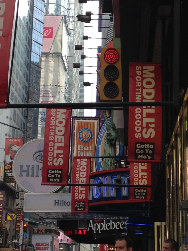
I rode the bus from NJ to Times Square where I walked around a little. Does any other place look like this?
Image

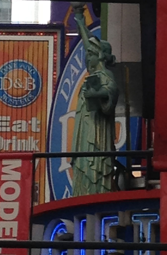
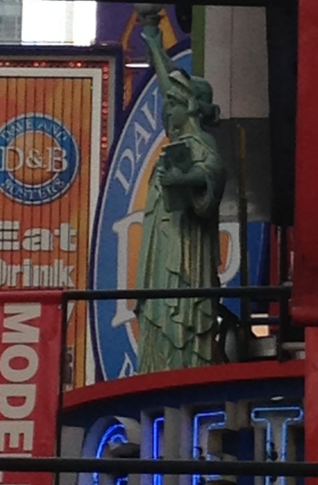
And even if it did, I’ll bet there wouldn’t be little Statues of Liberty all over the place…
Image

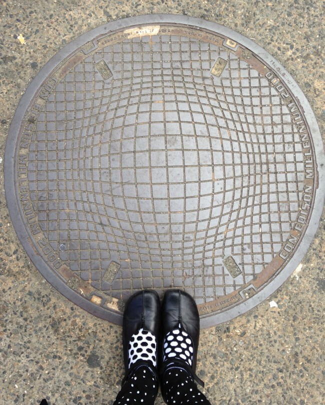
It was a beautiful day and people were out, everywhere. I was not the only one snapping photos, but I might have been the only one taking photos of manholes. I love this op art design combined with my very polka-dotty legs and feet. This would be a great machine quilting pattern!
Image

And, if I lived here, I would definitely be a NYC Sew-er! Image

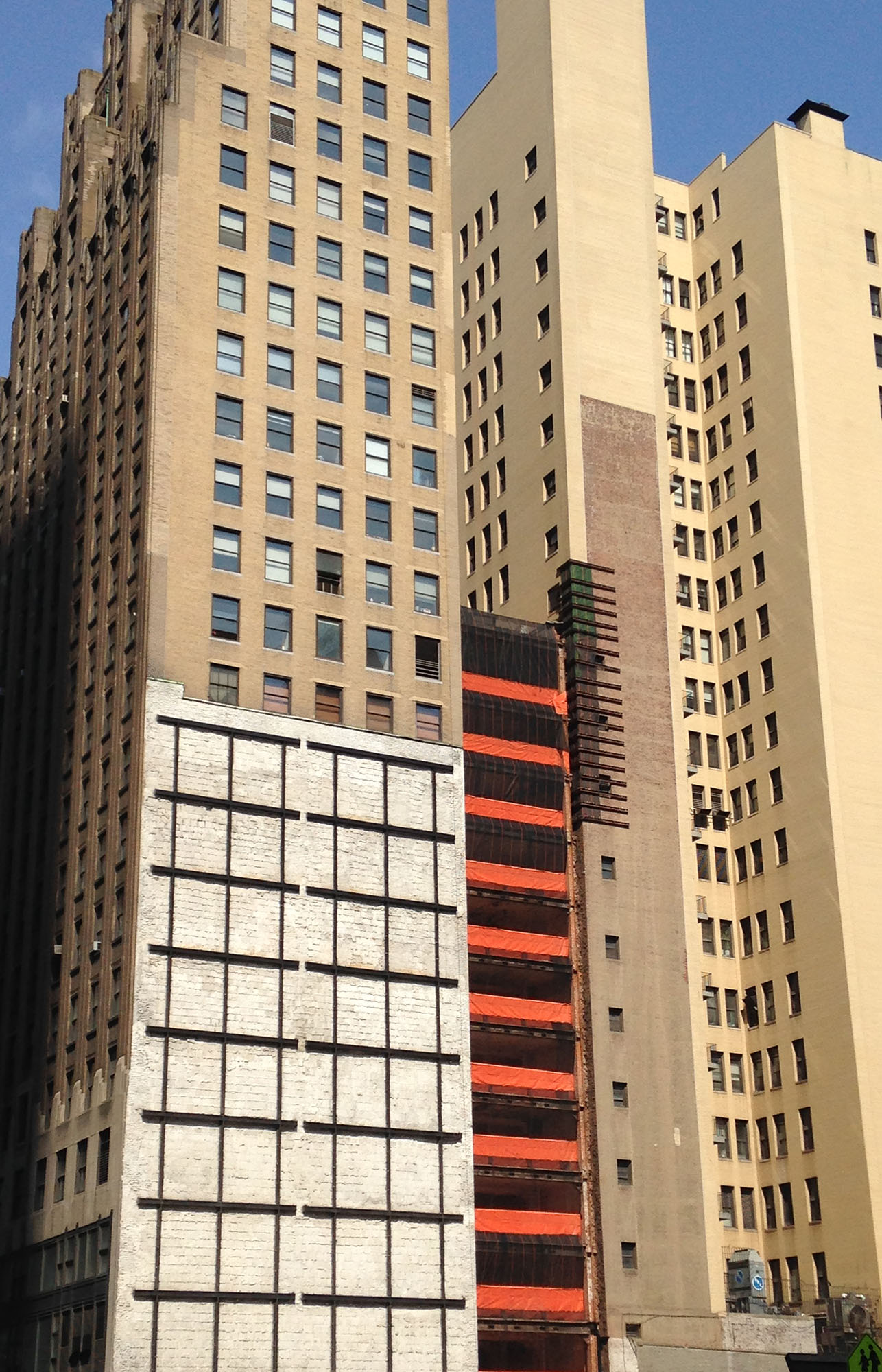
I did look up and there was so much to look at! This exposed set of building walls caught my eye…

Image

The dark grid of iron again the white cement blocks stood out from a distance. When seen with the horizontal orange strips of construction plastic and the narrow horizontal bars of something brown in the upper left and the rectangular windows, this makes an interesting composition. Adapted, it could make a nice pieced quilt.

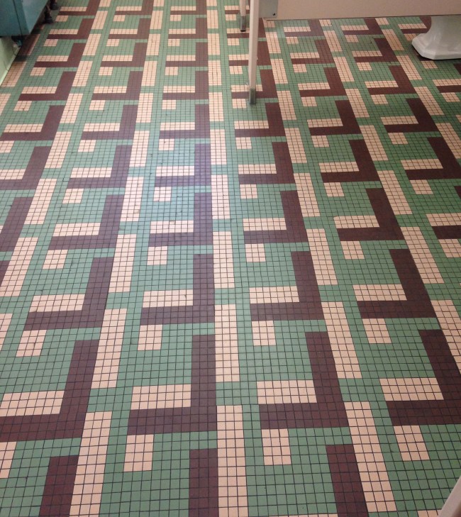
You might have seen the tile floor that I instagrammed… it, too, would be fun to piece:
Image

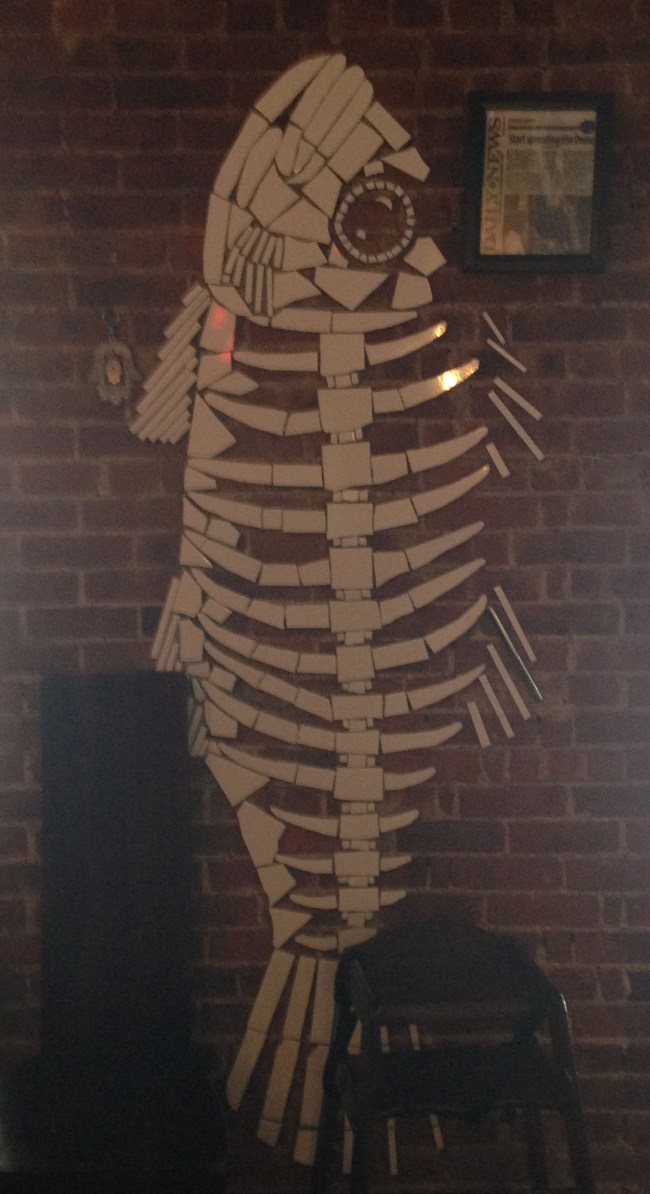
And as long as I’m posting tile pictures, here’s one from the restaurant Jeff and I visited for lunch. I should remember the name, but don’t. It serves Mediterranean food and is near the Natural History Museum. The fish mosaic is made from white tiles (broken or cut, or both) stuck directly to the exposed brick. No mortar was set around these tiles. It was a nice look and wouldn’t be that hard to do at home. There were other designs, trees especially, on other walls in the restaurant.
Image

I really hated to leave, knowing that it could well be next Christmas before I see Jeff again. That said, I did get to see him yesterday and that was wonderful!

Colorful California…

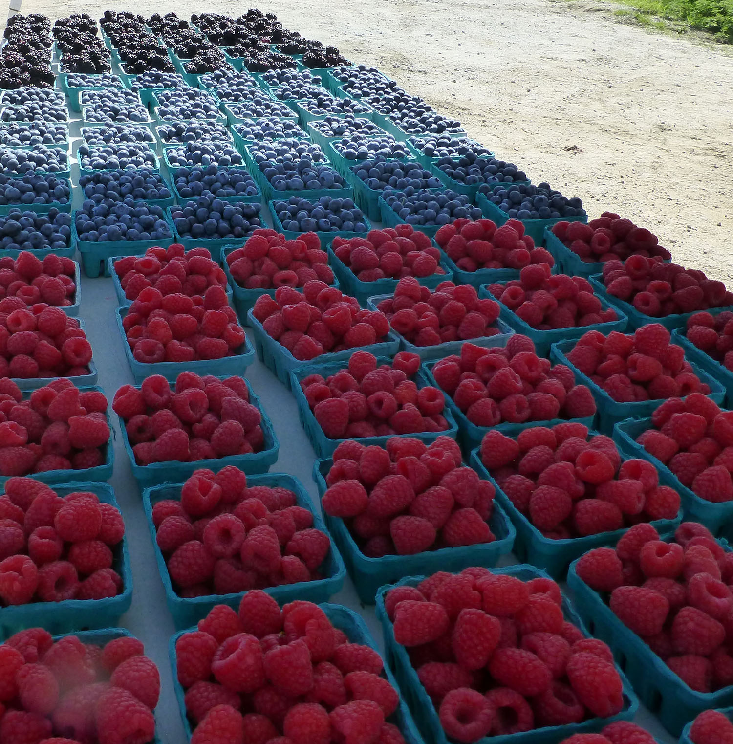
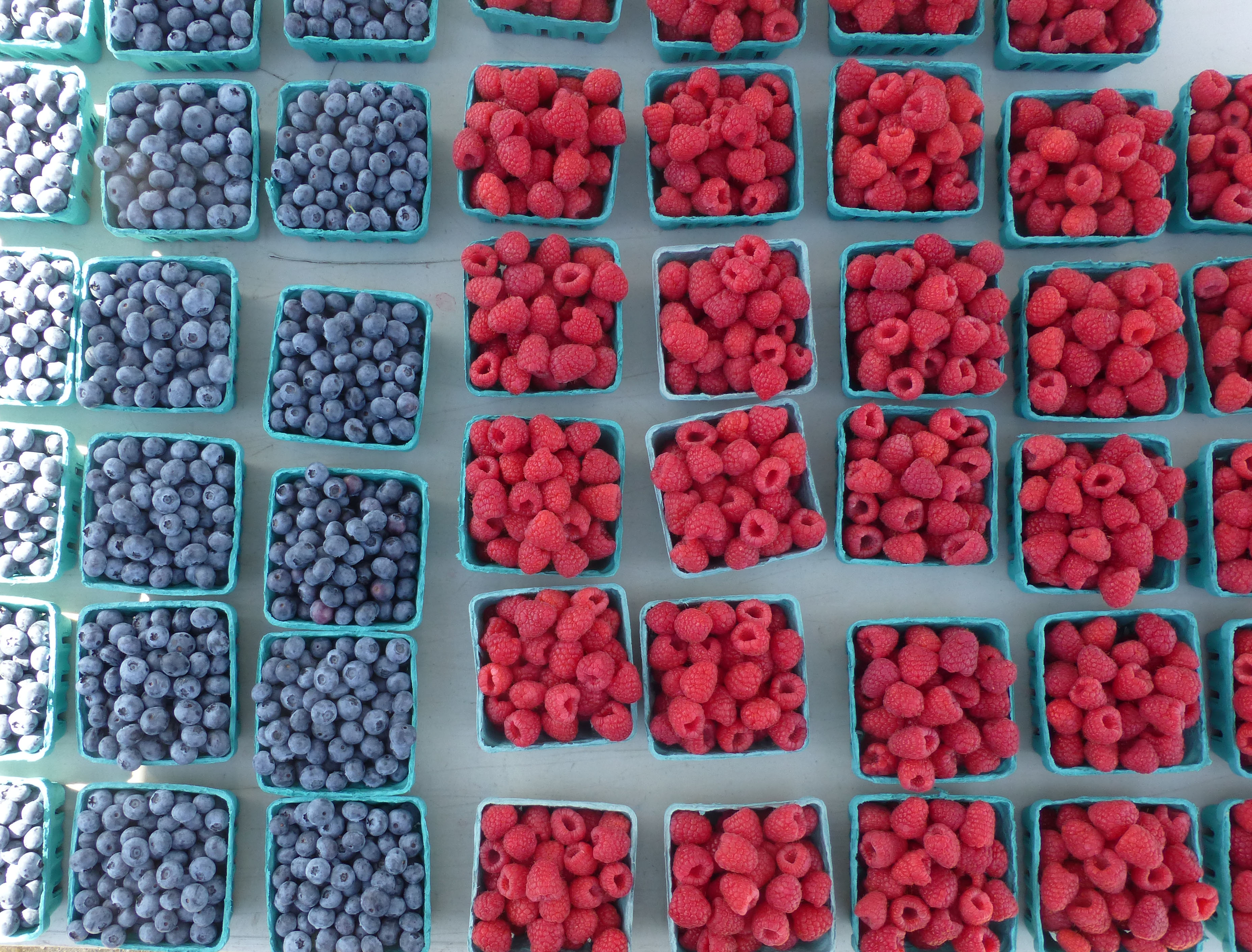
Digital photography is so very wonderful. Remember film? And the wait for pictures, most of which were awful? Digital photography makes it possible for each of to take amazing photos. That said, these are not ‘amazing’ but they are pretty.

Image

I love the aqua boxes. They are like sashing between the colorful fruit. The man behind the stand was looking at me funny as I took pictures of his tables.

Image

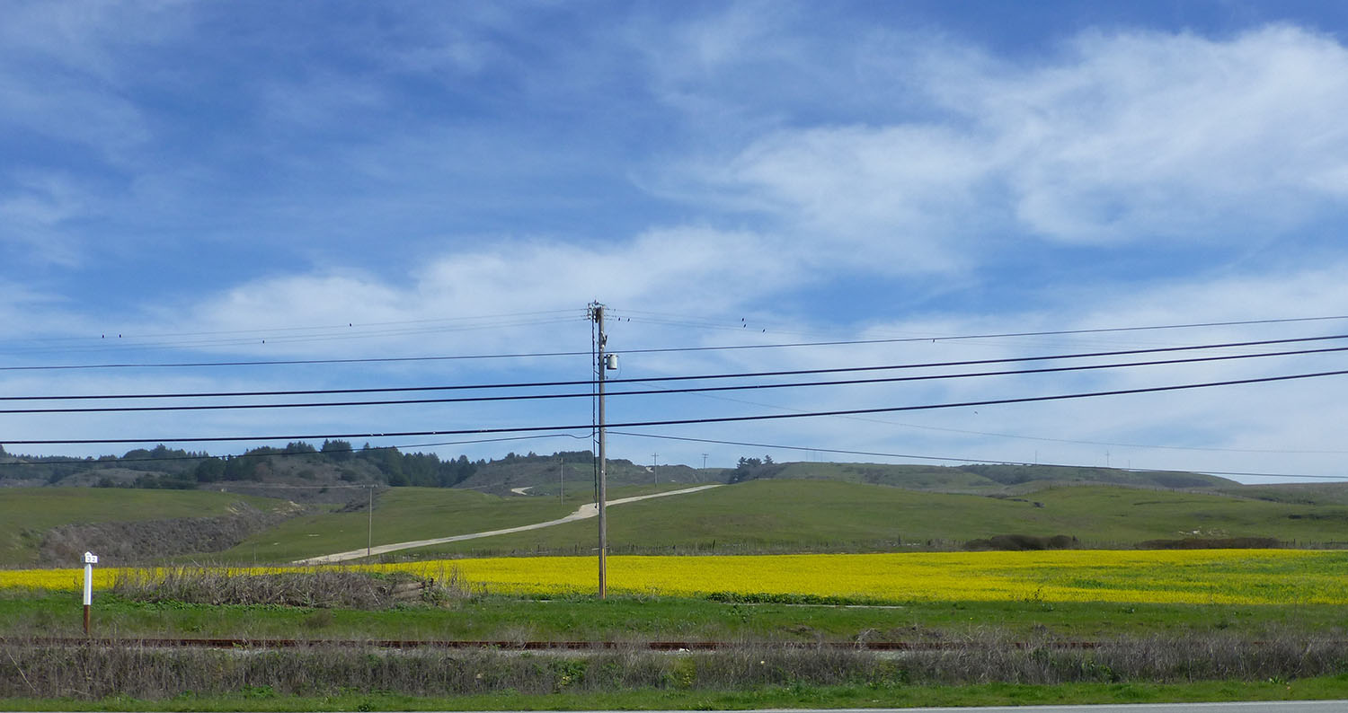
The field of yellow flowers (next) was eye-popping set into the drabber grasses…

Image

Farther down the road there was a bigger field of yellow with people scattered around in it, taking photos. Lots of kids sitting, surrounded by yellow. I’ll bet the pictures are terrific. We do the same thing in Texas when the bluebonnets are blooming.

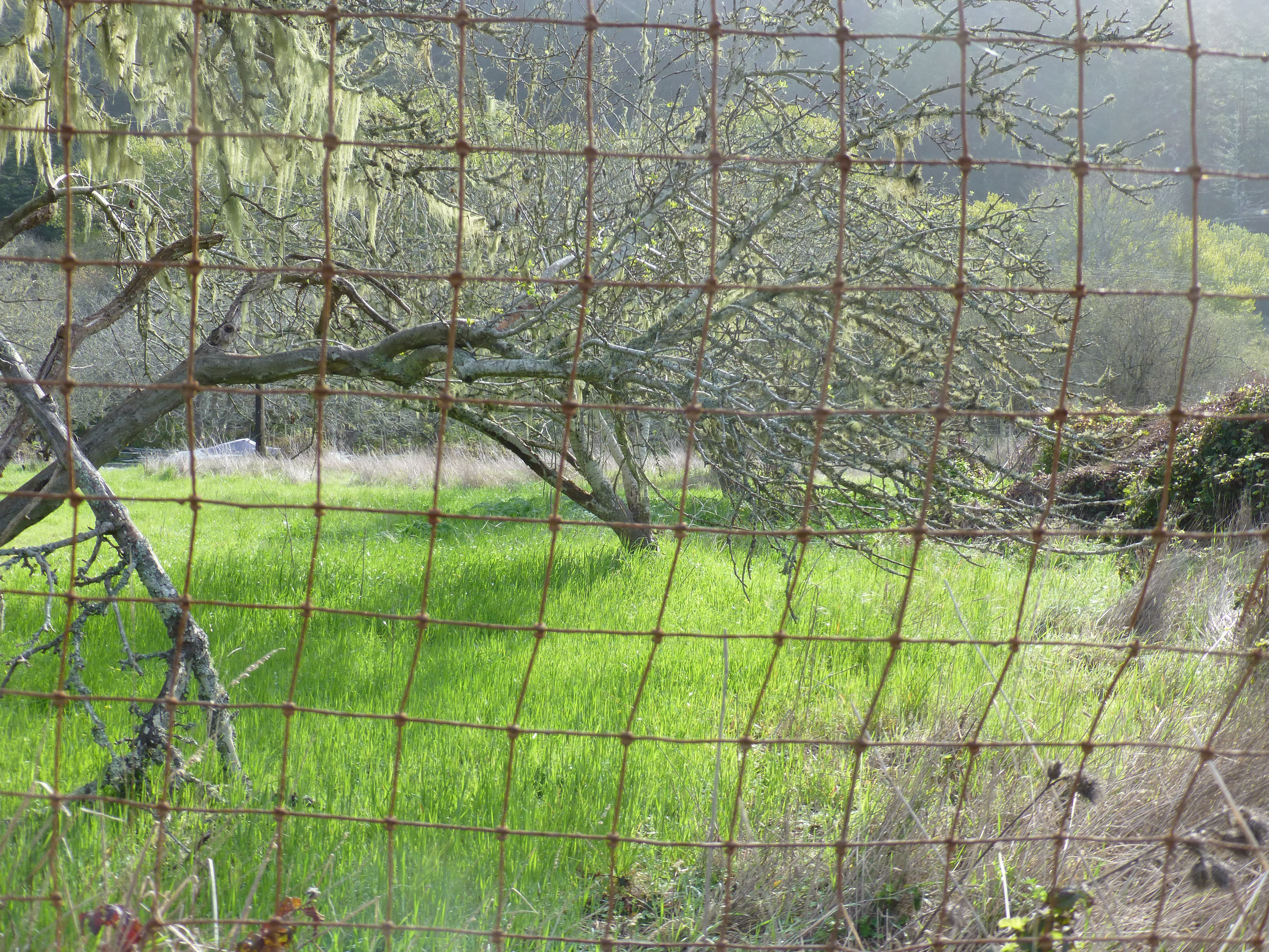
The next photo is not so much about color as it is the pulled grid of the fence that lays over the scenery behind.

Image

It suggests an interesting quilting pattern that could be sewn over a variety of quilt tops. Done well, it would be both interesting and sort of invisible… like a wire fence.